DIY Accessibility Testing Tips for WordPress
In today’s world, the name of the game is inclusion. And while web accessibility isn’t a new concept, in recent years web accessibility has become more accessible in itself.
At its core, web accessibility is the practice of design and building a website to be functional for as many users as possible. Users who are blind will interact with a website differently than users who are sighted, or color blind, or someone with impaired motor skills.
Originally released as version 2.0 in 2008 and developed by the World Wide Web Consortium (W3C), the Web Content Accessibility Guidelines (WCAG) are the golden standard for web accessibility. The current version, WCAG 2.1, outlines the best practices in the web accessibility space in 4 different categories: perceivable, operable, understandable, and robust. It is anticipated that the next version, 2.2, will be released at the end of 2022 to further define existing guidelines and add a few new guidelines.
In addition, accessibility is engrained in the WordPress community, and they are committed to incorporating accessibility best practices in the software itself. Some WordPress developers even go above and beyond on their themes and plugins. For example, WPExplorer’s own Total theme keeps accessibility at the forefront, so much so that the developer AJ is often making regular accessibility improvements himself.
WordPress accessibility is so important and it’s not as difficult to navigate as it once was. When working on a website redesign project, or even just adding new features to your existing website, here are a few items to consider during the design and build processes that will help your site fall in line with the current accessibility standards.
Design and Initial Build
Web accessibility standards should be considered throughout the duration of a WordPress project. Although the post-build testing processes will likely catch any errors that were missed in the initial build, it’s always best to build the site as “cleanly” as possible the first time. In this phase of your website project, consider the following:
Color Contrast

One of the easiest web elements to test for accessibility are colors. The WCAG 2.1 designates specific color contrast ratios for any 2 colors on a website (foreground and background). The contrast ratio must be at least 4.5:1 for normal sized text (under 18pt) and 3:1 for larger text (18pt and above).
But how do you know what the color contrast ratio is? WebAim, a trusted leader in web accessibility for over 20 years, has created a great tool for checking the color contrast ratio of your colors. Add a foreground color hex code and a background hex code and the tool will calculate the contrast ratio. If the ratio isn’t high enough, the value of each color can be adjusted via a slider to help determine passing combinations within the same color story.
Luckily, changing and experimenting with different color options on your website is a relatively simple process. WordPress’ native Gutenberg builder allows you to easily change the colors of an entire block of content or specifically target any number of specific words. You can also make adjustments in the theme panel to make global color edits.
Fallback Colors

These days, most sites are designed with loads of imagery. But for a variety of reasons, some users may be turning off images or styling on your site to get the information they need quicker or easier.
Imagine you have a panel with a large image and white text on top. When images are turned off in a web browser, the background of the site defaults to white. That white text is now invisible on the white background. What if that was important content, like a call-to-action or value proposition?
To resolve these issues, be sure to add fallback colors to all panels on your site with text on top of images. In the earlier example, changing the fallback color of that panel to black would resolve the issue, the white text would be visible. If you’re unsure of what color to use as a fallback color, the Web Aim color contrast tool is a great guide.
Multiple Navigation Options
Great menu design can be a standout feature on a site, but it’s also important to include multiple navigation options. Some users may be able to find the information they’re looking for faster if the site’s navigation was presented in another way.
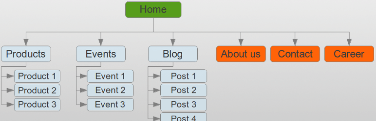
A sitemap linked in the footer of a website can be a great solution. This allows users to see all available pages in one area and could improve their user experience. The WP Sitemap Page plugin is a solid option to easily add a simple sitemap that can list pages, blog posts, case studies, portfolio items and more.
Another option would be to add a search functionality to your site so a user could quickly search your full site for a specific keyword or phrase. By default WordPress includes a basic search widget that you can use in your sidebar or footer, but there is also a search block within Gutenberg (as well most other page builders) and often theme developers will build a search box or icon into theme headers. Plus you can customize and improve WordPress search functionality with a variety of helpful plugins.
Accessibility Feedback Form
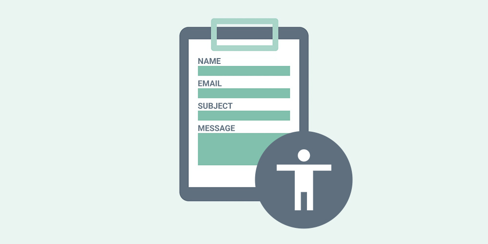
The footer of your website should also ideally link to an accessibility feedback form. Even if you take as many accessibility steps as you can, there’s always room for improvement as the guidelines and technology evolve to better accommodate users.
Including a page with an accessibility feedback form allows your users to submit additional comments or concerns regarding the accessibility of your website if something is missing and limiting their visit (just remember to use an accessible WordPress form). It also lets them know that you care about their web experience. You can then use this feedback to improve your site for that user and future users who need similar accommodations. Listening to the community and adjusting when needed is a critical part of the process.
Post-Build Testing Processes
Once most of your site is built, it’s time to begin a more in-depth round of accessibility testing. This should include automated testing and manual testing. Automated testing is a great resource and timesaver to catch certain issues. However, accessibility is a human-based concern and AI is not able to recognize all the nuances present. Therefore, it’s just as important to test certain elements of the site by hand.
Automated Testing
There are a variety of great automatic testing tools to foster a smooth accessibility workflow. It’s important to remember that passing automated testing is not enough to make a site accessible but it’s a great starting point.
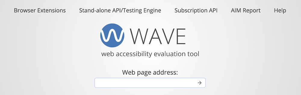
For a quick glimpse at whether your site is passing basic accessibility standards, the WAVE tool is a collection of automated evaluation tools that essentially scans a webpage and reports WCAG failures and items that need additional investigation. With the help of a browser extension, the WAVE tool will denote obvious accessibility failures in red. They are divided into errors and contrast errors. Errors are usually related to the coding of your site. Contrast errors are caused when your color scheme fails contrast standards (reviewed earlier in the article).
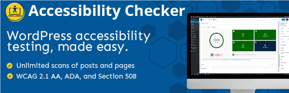
Once you’re ready to address any contrast errors on your site, there are plugin options like Equalize Digital Accessibility Checker that can streamline the adjustment process within the backend of your site. The free version of the plugin will automatically check page and basic posts to report regular errors and contrast errors on each page. Upgrading to the pro version allows for scanning of custom post types. The plugin makes it easy to identify the errors within the code and make changes as needed.
Manual Testing
As mentioned, there are limitations in the current tools and legal processes available for automated testing. The WAVE tool and Equalize Checker are great resources for automated scanning and can save a lot of time. But AIs that humans create do not need the same accommodations as real human users with a disability.
It’s important to review the site manually and use some of the tools a disabled user may be using to see if navigation and information collection is possible. A few aspects to check manually include page zoom capabilities, keyboard navigation, screen reader and alt text.
Page zoom testing should check to see if a page can be zoomed in to 200% without losing any content or functionality. This should be possible using only the browser’s native zoom capabilities and no other assistive technologies. You’ll also want to make sure zooming in doesn’t then require the user to scroll in both directions (top-bottom and left-right).
Some users are unable to (or prefer not to) use a mouse to navigate a website. They instead will use the keyboard to navigate, often using the TAB key and a few other keys to move between elements. For keyboard navigation testing, you’ll want to ensure that the interactive elements on your site have a visible focus outline when a keyboard targets that element. Also check all hover features to be sure TAB reveals any hidden content. While this process can be daunting, start with your key pages and try to TAB through each one. Are you able to access all content and links correctly?
Screen reader testing can be the trickiest of all as the technology is more niche. The best way to check the accessibility of your site for screen reader users is to actually run through your site with a screen reader. Is the hierarchy of your webpages clear? Are you using headers correctly and denoting specific elements as needed for screen readers?
Manual testing can be time-consuming and it’s difficult to ensure your site is accessible for all the assistive tools available for use. However, it’s an incredibly important step as these accommodations would be otherwise overlooked.
In today’s world, inclusivity is the best policy. An accessible website means more visitors can gain information about your company and potentially reach out. While there are no specific ADA compliant website requirements yet, if some users are unable to access the information on your website they need in order to take the next steps, you are losing potential customers or clients.
Use the information presented in this article as a starting point for your accessibility journey. Remember that web accessibility is an ongoing process as standards and guidelines are frequently updated to better serve the community. Approach this world with an open mind and an understanding that it may not be an open and shut process. At the end of the day, it’s all about improving the user experience for all your users.


Comments
No comments yet. Why don't you kick off the discussion?