Ten Possible Reasons Why Visitors Leave Your Website

How often have you landed on any website and hit the Back button on your browser almost immediately? Do visitors do that when they land on your webpages too? If the bounce rate on your website is increasing and conversion rate is falling, then it’s time for you to find out the reasons why visitors don’t like your website.
So why exactly might visitors leave your website? You really don’t have to look far to find the reasons. You may be aware of many of them, but here’s a quick shortlist of the more important ones.
1. Your Site Is Too Slow
Website loading speed is a big deal on the internet. No visitor wants to hang around to wait for your homepage to load. In fact, you can put a number to it – two seconds. That’s the time within which most visitors expect a page to load. Even a one second delay can translate into a 7% reduction in conversions. To Amazon, a one second delay means an annual loss of $1.6 billion.
But there’s no reason it should be like this, given that there are many things you can do to speed up your WordPress. Getting just a few of them right can help you improve the speed of your website.
2. Too Many Pop-ups
Yes, we all know pop-ups are great for conversions, and I’m not saying you should take them all down from your site. Not at all – merely that you use them judiciously. Else, your visitors are likely to simply move away, most likely to a competitor’s site.
Now, there are many things you can do to use pop-ups without harming your site’s SEO. For starters you can,
- Engage readers with your content for a while before you flash a pop-up
- Always give them an easy-to-find option to dismiss the pop-up
- Hide pop-ups from returning visitors
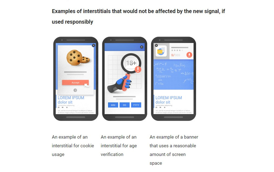
In fact, Google doesn’t take kindly to pop-ups that get in the way of visitors using your website, such as large sticky ads. Exit intent pop-ups are not so annoying to a reader, and if you must use pop-ups, you should seriously consider switching to them.
3. Your Website Isn’t Mobile-Friendly
The number of people accessing the internet from mobiles has overtaken the number of desktop users. So isn’t it time that you built websites that are fine-tuned for display on mobiles as well?
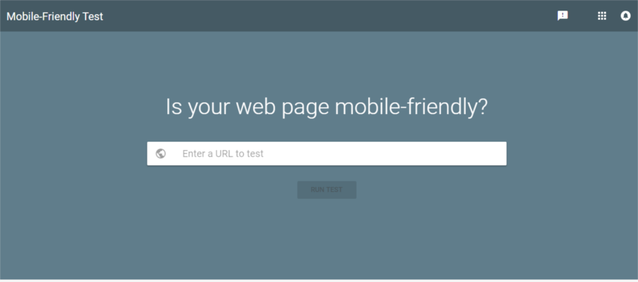
For a user to have a good experience of your site on a mobile, you need to ensure that they do not have to pinch or zoom for better viewing. CTA’s and buttons must be easy to find, without being placed too close to each other. There are many more things you can do to optimize your website to look good and function well on mobile devices. And after carrying out all the changes, you can check if your site is mobile-friendly.
Not to forget, Google will not send any mobile users your way, if it thinks your website is not user-friendly on mobile phones. That’s more than half of the internet users, so you see what you stand to lose if your site is not mobile-friendly.
Moreover, Google is shifting to a mobile-first index. This means that in any search initiated on a mobile device, Google will look at your mobile pages ahead of the desktop version.
It may also be a good idea to consder a mobile-first approach to designing your website, if you know that a majority of your visitors access your website from mobile phones.
4. Auto-Playing Audio/Video on Loading
Sure, we all like listening to music, but there’s a time and place for everything. How often have you opened a website to be greeted unexpectedly by some loud audio? In a public place, this can be rather intrusive. Even otherwise, it can distract you from the task at hand.
What can be worse is if you’ve got a number of tabs open and cannot identify the one from which the audio is playing. And, believe me, it’s easier for your visitor to reach for the Back or Close Button than search for the mute button. That’s another visitor you’ve lost.
Also, ads that play audio unexpectedly may be blocked by Chrome’s in-built ad blocker.
5. Your Web Design Is More Attractive Than Functional
The main focus of any website should be to present content in a pleasing manner. At the same time, users ought to be able to interact with it intuitively, without being distracted by too many attention-calling tricks such as GIFs and animations.
Attractive sites that are hard to use can pull in first time visitors, but when they realize that nothing works as it should on your site, they’re surely not going to return.
While designing your website, it’s a good idea to:
- Keep up with modern trends that internet users are familiar with
- Be consistent in design across the entire website, without throwing up a surprise on each page
- Pay attention to fonts (skip the urge to add multiple typefaces), colors, white spaces and layout
- Keep text blocks small, an overcrowded page with loads of text is a sure way to send a visitor scurrying
- Use sliders only when relevant and keep advertisements to a reasonable number
Ads that open to the ad’s website when a user clicks ‘X’ to get rid of it are surely a big No. That’s the equivalent of fooling a visitor, and he/she is not going to take kindly to it.
Instead, you should try and add helpful user friendly-features such as ‘Return to top’ on a long page or a helpful ‘Search’ option.
6. Your Images Are Boring
If you’ve been running a website for any length of time, you should know by now that images form a major part of any good website. So why not find some appropriate, unique and attractive images for your site? Stock images are not always okay, especially if you pick the first appropriate image that you come across. Chances are that many other websites are using them, and that’s not going to make your website a standout with internet users.
We’ve put together a list of places where you can find the best stock photos for your site, but you can take it a step further and create your own photos too. Use photos of real people around you or create your own images. Moreover, if you’re a paying customer to the websites that stock images, you’re likely to find images that are not so common on the internet.
7. Content Not Up To The Mark
A website is only a platform for the content that it holds. People access your website for the main purpose of consuming your content. So the information you have there should be unique, useful and presented in a conversational manner.
In practical terms, this can mean:
- No duplicate content. This is penalized by Google, so it’s important that your content should not be repeated both from within your website as well as across the internet
- Similarly, keyword stuffing is also frowned upon by Google
- Your titles and headlines are what catch a reader’s eye and get them to read further. While writing catchy titles, make sure that what’s within matches up to the title
- A well-crafted “About” page gives context to the content and makes it more reliable to a visitor
Additionally, information appropriate to the website must be included and, if important, displayed at appropriate places. For instance, on an eCommerce site I’d want to know the cost before I add it to cart. Or, if Free Delivery is available before I proceed to checkout. It would also be nice if you don’t ask for unnnecessary information such as location or age of the visitor. I mean, it makes sense for Google maps or an eCommerce site to ask this, but that’s not the case for many other websites.
Many readers find it annoying when websites ask them to disable ad-blockers. Sure, it’s easy to understand why they do so. But in most cases, users can easily find what they’re looking for on a competitor’s site without disabling the ad-blocker.
8. Your Site Navigation is Lacking
Is your website hard to navigate? Are visitors left wondering which button to click next after they reach your website? There goes another visitor, possibly never to return.
Navigation on a website has to be intuitive, allowing visitors to find the content that they’re looking for easily within your website. WordPress has a number of options when it comes to helping you get navigation right. By and large, it makes sense to stay with the tried and tested navigation methods that most internet users are familiar with. Also, keep in mind that a search function is always appreciated by visitors.
You also need to make sure that all links – both internal and external- work fine. No broken links, for sure.
9. Your Site Isn’t Secure
Have you noticed the “https” at the start of the URL on this page? This means that WPExplorer has obtained an SSL certificate and all the communication between your browser and this website is encrypted. This makes it difficult for third parties to listen in on the conversation or to mess with it. This gives users the confidence to interact with your site, especially if it’s one that collects sensitive personal information or accepts payments online. You can read up more on this in our earlier HTTPS guide.
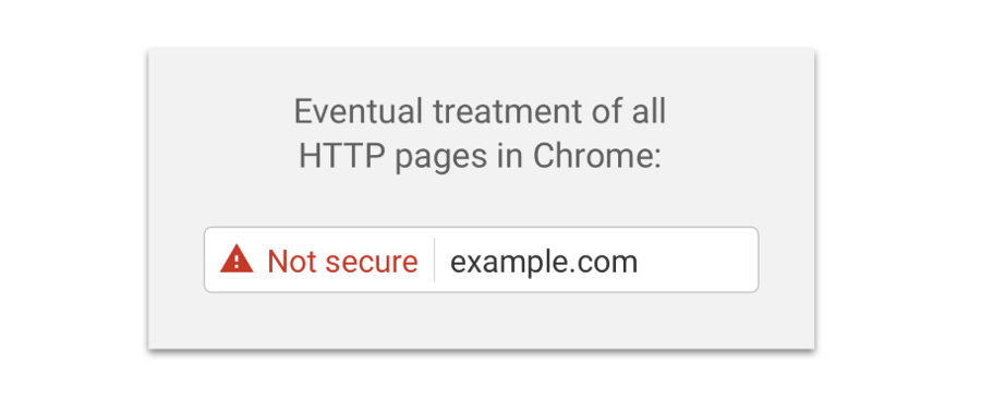
Not only that, your website runs the risk of being labelled as ‘Non-secure’ if it does not have an SSL certificate. Now with Let’s Encrypt, adding security certification to your website is rather easy.
10. What’s Above The Fold On Your Homepage?
It’s also a good idea to put the most important details of your website immediately visible to visitors when they land on your homepage. The name of your website, a tagline that indicates what it’s all about and a menu that leads to the website’s content must be apparent to visitors on landing on your homepage, without having to scroll. This way you’re being helpful, and a visitor knows immediately what your website is all about.
Use hamburger menus only if you absolutely must. They make sense on mobiles, but not so much on a desktop. Some readers maybe confused, wondering what to click on next.
Wrapping Up
Your website works for you even when you’re sleeping. A little understanding of audience preferences and adjusting to them will get visitors to engage more with your website and stop them from scampering away in a hurry. You get less than two seconds to make a good first impression, and you’ve got to do all you possibly can to live up to user expectations.