Tips to Create High Converting Forms with WordPress

If you’re not using various types of web forms on your WordPress site, then you are missing out on many advantages: engagement, security, and higher conversion rates. Whether you are the owner of an e-commerce site, a blog or a business site, online forms are extremely important. They provide a two-way communication between you and your visitors. However, bringing visitors to your site is not enough. You also have to improve the user experience and web forms are a part of that.
Forms are generally perceived as unimportant details, so they are usually ignored, which usually leads to a frustrating and negative user experience. Fortunately, if created properly, online forms provide several advantages to your WordPress site:
- Track the number of visitors and discover more about them
- Receive less spam
- Provide quick communication
- Provide automated responses to queries
- Encourage visitors to return to your site
- Enable visitors to order online
- Enable visitors to subscribe to email lists
Use Google Tag Manager
To be able to create a better user experience and more effective web forms for your site, a good idea is to use Google Tag Manager. It is a tool that simplifies data collection from your website for use with third-party programs such as Google Analytics, Facebook, and more.
Google Tag Manager is often used for webform tracking. Especially for contact forms, which work as a tool for conversion. A contact form builds the start of a relationship that can be nurtured until the prospect can become a customer or even an advocate later on.
With the help of Google Tag Manager, you can find out which forms are filled out on your site and track form abandonment. Therefore, you can improve the conversion rate of your web forms by identifying frictions and drop off points. In addition, you can also discover how many users start filling out a form but then decide not to submit it.
Google Tag Manager can be integrated with heatmap programs, which enables you to analyze the customer journey on your site. Thus, you will be able to identify which fields on forms cause a block or an exit of the visitor.
Google Tag Manager for WordPress

Google Tag Manager for WordPress is a free and easy to use plugin that places the GTM contained code snippets on your site. There is no need to add them manually. It also pushes user details and page meta data into the data layers. Plus, you can add Google Optimize container with its setup.
Implement A/B Testing
To avoid pitfalls in the web form conversion process, A/B testing is always a good idea. It’s not a magic formula that guarantees 100% success, but it definitely can help you build more engaging and effective online forms for your WordPress site. A/B testing is a statistical method that tests one form against another, such as 2 or 3 web forms, and measures their effectiveness.
Although it can be tempting to test many things, be specific, and decide what you want to test: the copy of the submit button, the background color of the form, the font? Would more users convert if one or several of these elements would be changed?
Once you have decided what you want to test, you will need to set a goal. For example, you want to increase the conversion rate and want to test which submit button copy is more effective. When A/B testing is important to test only one variable and then you will have to wait, depending on your web traffic. What does this mean? It means that the more visits you can track, the more accurate the test will be. Generally, you need to get at least one hundred visitors to each version.
For A/B testing you can use Google Analytics or paid tools such as Optimizely and Visual Website Optimizer. Google Analytics redirects your form visitor’s browser to a different page that includes the web form you need to test. Most probably, the user won’t notice these redirects as they are almost instant, so no need to worry about that.
The paid tools change the way an online form appears in the user’s browser. Using these paid tools you can measure your web form conversions, which generally doesn’t require coding skills.
Nelio A/B Testing

Nelio A/B Testing is a complex and very useful conversion optimization tool for WordPress that combines A/B tests with Heatmaps. It enables you to test headlines, widgets, create alternative content for your posts, pages, custom post types and to track the progress of your tests directly from within WordPress. In addition, you can test alternative CSS, themes and track your visitors’ most important actions.
Create Conversational Forms
Getting into the users’ minds is one of the most important things that businesses want to achieve as it is one of the pillars for their success. Conversational forms are an effective way to tap into information from customers compared to traditional web forms. Although standard forms will still be used, there are cases when conversational forms are more efficient. Especially when it comes to a higher conversion rate.
The amazing progress of chatbots for WordPress live chat have made collecting data on leads and feedback from customers much easier and effective. Due to this new type of form, a “conversation” with users is more natural. It’s a better alternative the cold and transactional traditional online forms. By replacing the traditional forms on your site with the new ones, you will be able to take the users on a pleasant, natural and conversational journey and collect important data the easier way.
As a result, users provide data which under other circumstances would seem sensitive and personal. In addition, there is no more need for CAPTCHA. The reason is very simple: the fact that a user is able to navigate a conversational form is the best proof of their humanity.
Additionally, visitors don’t need to go back on the form to add data or correct mistakes, so the user experience will be much improved due to less friction between users and screen, which will increase conversion rate.
Focus on UI Design
A better UI design will definitely help you get higher converting forms on your WordPress site. To increase trust and to deliver a great user experience, you need to tell the user exactly what is the next step to know what to expect and also to clean up your form fields.
With WordPress, most forms include basic styling options or take on styling from your theme. So using a good UI design shouldn’t be too difficult. Just make sure to check your form fields in different web browsers and devices.
Decide on Form Fields
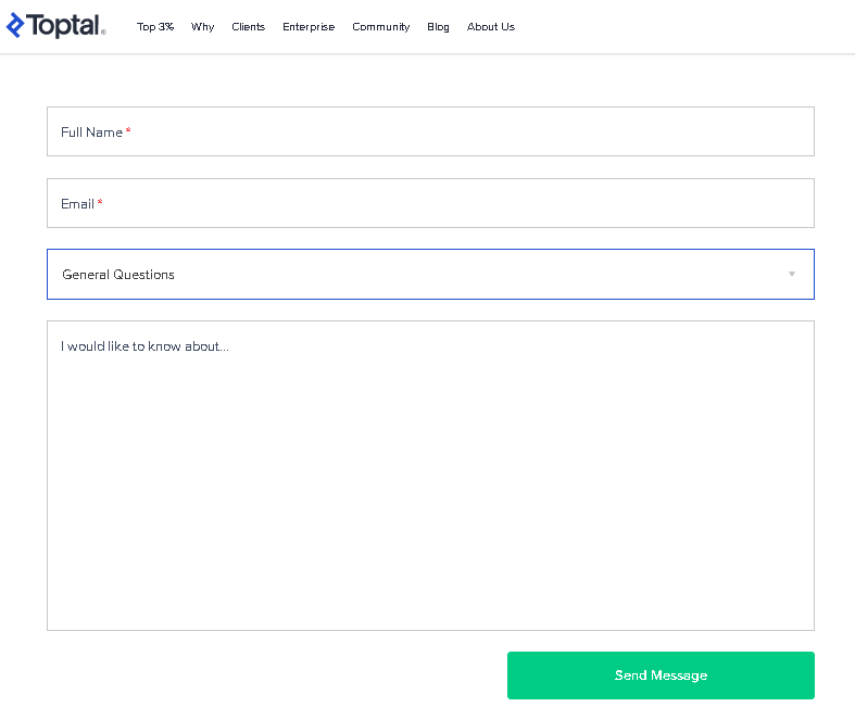
Contact forms are used for visitors to ask you questions, explain their needs and concerns. This type of form requires leads to list their email address, name and sometimes, order number. Contact forms may also feature a drop-down or a text-entry field for leads to select the reason for getting in touch. How is your contact form designed? Is it easy to be found, to use?

This contact form from Toptal is an example of how simple, yet effective it can be. It also matches the company website’s aesthetic, it’s clean and organized in order to ensure a positive user experience.
Add Placeholder Text
Make sure there aren’t too many and unnecessary fields to add disturbing length to your web form. By adding a placeholder text in each field will make it more likely for people to keep in mind what information they need to add and it will make your forms seem shorter.

A good example is the subscribe form from Shopify that includes a placeholder to the top of the form field, with the label in front of the users. It’s a small tweak, but very effective, which will improve your conversion rate.
Consider Multi-steps Forms
Multi-steps forms are also a wise choice if you want higher conversion rates. A multi-step form is a longer form that is split into multiple pieces. It allows users to fill out information in smaller chunks, giving them the impression that the form is actually not that long, improving user experience and increasing conversions. The process seems easier, more manageable for users to fill out. It is a good idea to split forms when users have to fill out registration forms, order forms as they require many details.
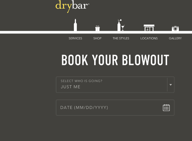
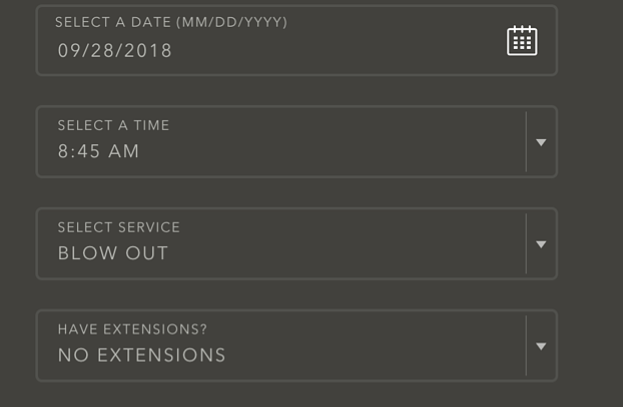
Below, you can check out the DryBar’s registration form. It features several sections ranging from questions about who is going, to appointment date and payment details.


Generally, multi-step forms convert well because there is less psychological friction, the progress bar lets users know what comes next and encourages them to complete the form and answer sensitive questions on the final steps when it’s more likely to respond after already filling out previous steps.
A few recommendations for multi-step forms that convert are the following:
- Include low friction questions first
- Show users the progress they have made and show how many steps are left
- Include image selector buttons to reduce typing
- Use conditional logic
- Don’t ask too many questions per step
Highlight Details with Tooltips
Tooltips are also a simple, but very effective solution to make your forms convert. They can provide detailed information to help users, as they are displayed when users hover over a particular form field. Or they can be used on forms that require more details. Tooltips provide helpful details about a specific field label if the user needs it without compromising functionality. Plus, by adding them, your forms won’t be filled with the wrong information.
Use Good CTA Button Copy

High-quality and effective copy compels users to take action when they read it, which helps your conversion rate increase. The webform copy needs to be clear, concise, and actionable content that encourages users to interact with your brand.
The CTA button copy is very important. The more visitors click on your call to action button, the higher the conversion rate will be. To make sure that as many visitors as possible will click on it, you need to use great copy to attract and persuade visitors to opt-in.
Usually, the same words are used for CTA buttons as we believe that it is not so important. However, words play a huge role when we want our forms to convert visitors into leads. By using the right words or by tweaking the button copy, conversion rates can increase.
For example, try to not use the words “Submit” or “Click here”. Instead, use words or action phrases relevant to your industry or that make the customer curious about your CTA. A good idea is to offer a discount through your call to action button as we all like to save money. Another option is to create a problem-solution CTA. This is a sales tactic that is used by companies to explain the solutions they have to their customers’ problem. To create this type of CTA button copy, ask yourself the following:
- What problem does my service or product solve?
- How can I communicate that succinctly and also expressing a sense of urgency?
- How can I show and express that my product/service can solve their problem quickly?
Other general recommendations for CTA button copy include using emotions, adding value, creating a personalized CTA and making sure that it is not too long or too wordy. Use between 90-150 characters and avoid a descriptive language. Your goal is to provide value and persuade users to click in a short amount of time.
All of the tips we’ve looked at above are based on real-world research. For accurate and more effective results you need to rely on your own data to boost your web form conversion rate for your WordPress site. Make sure you will use a high-quality analytics tool to pick out conversion blockers that your users are experiencing when trying to fill out your online forms.
No matter what type of online forms you use, try to reduce friction as much as possible to increase the conversion rate. Making the user experience a better one, you will notice that conversion and your communication with potential customers will improve.


