10 Weekend Projects to Make Your WordPress Site More User-Friendly by Monday
For some, weekends are meant for partying. For entrepreneurs, the weekends are when they standout from the competition.
Weekend projects make complete sense for a small business owner, since there’s far less pressure to hit a deadline. In short, weekends feel more like fun work.
Weekends are great for focusing on the user-friendliness of your website. Whether you have an authority blog or a thousand-product eCommerce site, user-friendliness is often an afterthought once you get your business rolling.
That’s why the weekend is so great, because you can take a little time to squeeze in a weekend project to make your site more user-friendly by Monday. Let’s take a look at some of those potential projects.
1. Get User Feedback on Your Website
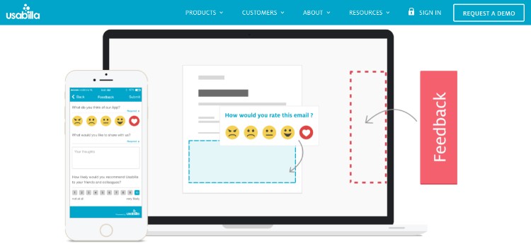
The first step to changing around your user-experience is to understand what you could improve. After all, you don’t want to change around something that’s not broken.
Some of these require payments, while others are free. You can also search for more user-experience testing tools through Google. The whole point is to see what people say about your website, allowing you to make educated decisions when it comes to modifying the UX. It’s also not a bad idea to send out a survey to your current users, since they’re the ones using your site.
2. Make Every Page and Post “Readable”
In the digital world people aren’t as interested in reading anymore. It’s a shame, but that means website managers need to construct content that’s readable. Therefore, we need to construct a full weekend plan for scouring your website and adjusting anything that might not pass the “readability” test.
Here are some tips to get you started:
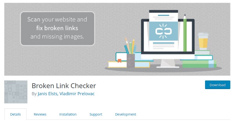
- Find broken links and either redirect them to other pages or place content on those pages. For external links you can simply remove them. You should also consider setting up nice 404 pages for people who end up on the wrong pages on your website.
- Make your fonts beautiful by converting most of your online text to San Serif fonts. Readability declines when you jump from one font to another, so stick with uniform fonts throughout. Not only that, but start using short headers to grab attention and guide user activity.
- Evaluate all pages to see if enough white space is being used. Sometimes you need more spaces, while other times you need to get rid of the sidebar.
- Ensure you have some contrasting color schemes when placing text over imagery or colors. Otherwise people won’t be able to read the text.
- Use scannable techniques such as headers, short paragraphs, bullet points media to break up text and more.
3. Test and Adjust the Navigation and Search Bar
If you’re missing a navigational menu or search bar, now’s the time to include both. More often than not you’ll already have these. But menus and search bars rarely have the optimization they need.

Over the weekend you can implement an A/B test program or a heatmapping system. This way you can run some tests to evaluate where your customers are clicking when it comes to your navigational menu and the search bar.
Maybe you’ll notice that not a single person touched your search bar. Does that mean it’s too far down on your homepage? Would it help if you put it in the header instead of the sidebar? After raising questions like these, run more tests next weekend to see if anything changes.
4. If Not Selling Online, Start Accepting Online Orders
This applies to physical products, digital products and services. One of the major points of having a website is to cut out unnecessary processes.
For example, a massage therapist used to pick up the phone over and over to book clients in his schedule. But a simple booking plugin would cut out all of those phone calls.
The same goes for physical products. Although it might be intimidating to sell online with your small brick and mortar store, start with just five of your best selling products, then see how it works.
5. If Selling Online, Offer Additional Payment Methods
An online store should absolutely accept every major credit card. That’s a given. However, several other payment methods may boost your sales by gaining access to smaller communities of people with more obscure payment methods.
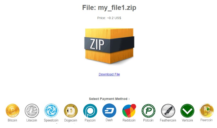
PayPal is one of the best examples, since many users feel more secure paying online with their PayPal accounts. Another example is Bitcoin, the decentralized, anonymous digital currency. Not only can you convert Bitcoin to regular currencies, but it decreases fraud since the customers can’t request refunds.
But for whichever gateway(s) you want to add, it’s as easy as installing a plugin. WooCommerce and Easy Digital Downloads both offer a huge variety of premium add-on for popular gateways, an there are even more options available from 3rd parties.
6. Construct an Easily Accessible, Comprehensive Support Area
Not all websites require knowledge bases, but every single site on the internet should have some sort of support area, or a compelling contact page.
FAQ pages are nice for small blogs, and all support pages should have direct links in the navigational area. As a weekend project, I encourage you to make a list of your ten biggest competitors (or similar websites). Take a look at how they provide support and which pages are used for sharing contact information, social media pages, important information to questions and more. Then, use that as a guide to create pages for your own site.
7. Make and Fill Social Accounts (Then Link to Them on Your Homepage)
This one’s simple, but it’s more about spending the time to develop a content plan.
The first weekend can be about filling the Facebook and Twitter pages. After that you can ask how often you’re going to post. Which type of content is going to get the most shares? Stuff like that.
Once that’s setup you can move on to adding your social stream to WordPress, getting more social followers and even automating your social sharing.
8. Walk Through the Steps Needed to Speed Up Your Site

Learning how to speed up your site not only impresses Google but it keeps your users around for a longer period of time. I suggest you go through the many different guides we have about speeding up WordPress sites:
- How to Speed Up WordPress
- How to Speed Up Your WordPress Site with CDN77
- 10 Ways to Speed Up Your WordPress Site
9. Use Relevant Icons to Break Up Chunks of Text
This ties into readability, but it’s more about presenting your products and services on the homepage. Far too often we see well-written copy that explains your services in a creative way. However, the paragraphs blend together and you’re missing one thing: Industry relevant icons.
![]()
These are the most basic of visuals, but they make such a big difference when it comes to UX. The WP SVG Icons plugin is a wonderful place to start, but you can generally look around on Google to find all sorts of free and premium icon packages.
10: Make Your Site Responsive
If you haven’t already heard, mobile users love mobile-friendly websites. In addition, Google will reward you for one.
I suggest you find a WordPress theme that’s completely responsive. Most developers who are creating well coded themes make them responsive from the get go (like our Total theme for example). But if you’re happy with your current theme that it isn’t mobile ready, consider making your current site responsive with the help of Jetpack.
Have Fun This Weekend!
There you have it! You now have several weekend projects to make your site more user-friendly by Monday. If you have any questions regarding these projects, let us know in the comments section below.


Comments
No comments yet. Why don't you kick off the discussion?