How to Improve Cumulative Layout Shift (CLS)


Most websites are built to be accessed from various devices with varying screen sizes and resolutions. Thus, maintaining the same experience across multiple platforms can be difficult. WordPress makes cross-platform web design easier. However, in any form of software development, building a one-fits-all solution can be complicated.
In the case of web development, users navigating from page to page on a website may sometimes experience what is known as Cumulative Layout Shift (CLS). It’s when a page’s visual elements undergo a sudden change or load incorrectly. Suddenly text becomes larger or smaller, images change their position, or the entire page layout changes.
Why does this occur, and how can we fix it? In this guide, we’ll explore what CLS is and how you can prevent it on your website.
What is Cumulative Layout Shift?
The most common perceivable form of CLS is lag in the loading of images. On complex websites that are heavy with visual elements, you’ll often notice that the text loads before the media elements. Furthermore, the layout of the web page changes when all the visual elements are finally loaded. These incidents occur whether you’re scrolling or not.
When a web page has a high CLS score, it’s hard to determine when it has fully loaded. The more complicated and media-heavy the website is, the higher the likelihood of experience layout shifts.
For instance, simple search engine web pages with very few visual elements have little-to-no CLS. However, this doesn’t mean that all complex or feature-heavy websites have high CLS scores. For instance, Amazon’s online store is replete with widgets, images, and links, but it loads quickly without any perceivable shifts.
What Causes Cumulative Layout Shift?

CLS tends to occur because web browsers load elements sequentially at different times. Additionally, you might have media elements on your website with unknown properties (such as dimensions).
In cases where you don’t specify the width or height of a media element (such as an image), your web browser won’t know how much space to allocate until the web page loads completely. Hence, the drastic layout shift. In sum, the primary reason for most CLS is inefficient loading.
It’s important to note that even if you don’t notice the layout shifting in real-time, it doesn’t necessarily mean there isn’t any shifting occurring. Web browsers often cache website data, so it’s easier to load webpages when you revisit them. Measuring the CLS score is the best way to determine if your website undergoes substantial layout shifting.
How to Measure Your Website’s CLS Score
The CLS score denotes the number of layout shifts a web page experiences throughout its lifespan. We can derive the CLS score from what is known as a session window. A session window describes the number of layout shifts that occur within a five-second interval. To calculate the CLS score, we need to multiply the distance fraction by the impact fraction:
CLS Score = Distance Fraction x Impact FractionThe impact fraction describes how much an unstable element affects the perceivable area between two frames. The distance fraction describes the amount an element has shifted between frames. A CLS score of 0.10 and below (0.0 – 0.10) is great. A CLS score above 0.10 but below 0.25 (0.10 -0.25) is moderate and requires improvement, while a CLS score above 0.25 (0.25 <) is poor.
These concepts may be a little hard to wrap your head around. Luckily, you don’t have to calculate your website’s CLS manually. There are a slew of online (and offline) tools that can calculate the CLS score for you.
Currently, the most popular way to measure your web page’s CLS is through Google’s PageSpeed Insights. It allows you to ascertain your website’s user experience statistics for both the mobile and desktop iterations.
Other CLS tools include:
- GT Metrix
- Google Web Vitals CLS Debugger
- Google Chrome Web Vitals Extension
- Google Lighthouse
- Webpage Test
Since Google’s PageSpeed Insights is the most familiar, we’ll use it for our example.
To measure your CLS score, navigate to the PageSpeed insight home page, insert your Web Page’s URL into the top text field, and then click on the Analyze button. Depending on the popularity of your website and internet speed, PageSpeed Insights should supply you with a report within a few seconds.
To find your CLS score, scroll down to the Core Web Vitals Assessment section.
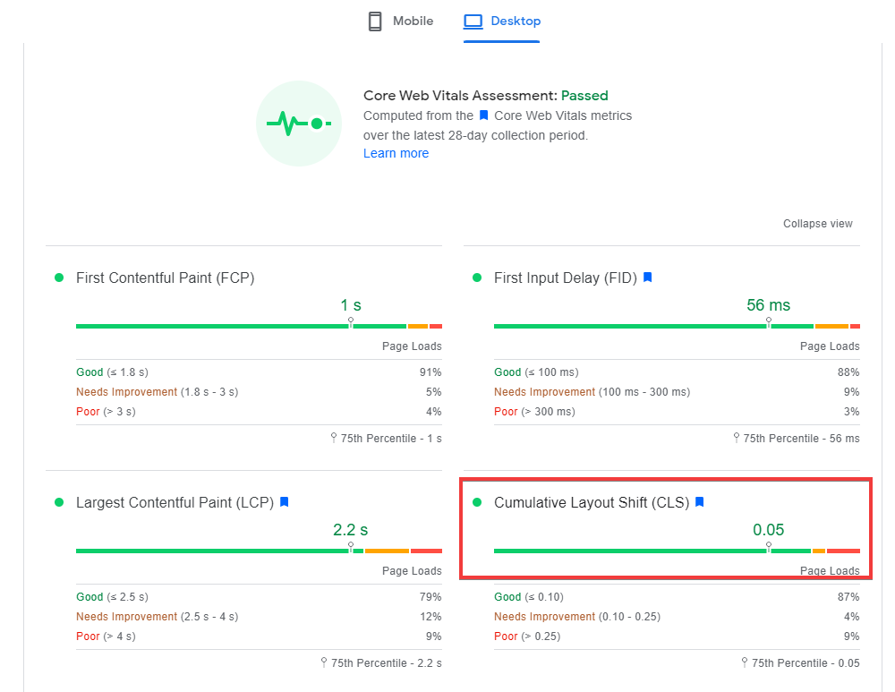
If we use Amazon’s homepage as an example, more than likely, we’ll find a CLS score of less than 0.10. During our testing, we found that the mobile website had a CLS score of 0.01, while the desktop version had a score of 0.05.
But how do they do it when their site is so resource-heavy? Let’s look at how you can have an Amazon-like CLS score too.
How to Optimize CLS
The best way to see which elements are causing your high CLS score is to use the Google Web Vitals CLS debugger. It shows you a GIF of all the shifting features on your website. Ads and media files are the most common culprits for high CLS scores. Other causes may include fonts, asynchronous CSS, animations, and Iframes. To improve your CLS score, you’ll have to optimize these elements.
Ensuring that your website has respectable CLS is as important as ensuring that it has strong local SEO and relevant content. Google’s search engine tends to give preference to websites that provide a great user experience and are well-optimized.
To that end, here are a few steps to improving your site’s CLS score:
Add dimension properties to all media files
If you upload media files with unknown properties, it will increase the risk of layout shift because your web browser will need to figure out the size of your image and determine the layout orientation after loading. These situations have a greater chance of occurring for large high-resolution images and files.
By uploading media files with missing size properties, you’ve placed too much work in the web browser’s hands. You must add the height and width properties for every visual media file you upload. You can do this by viewing your source code and manually adding the width and height properties.
Ensure fonts are loaded locally
Text must remain visible during font loading. The first step to achieving this is to ensure that fonts are loaded locally instead of being pulled from third-party font websites.
If you find that your fonts are being pulled from a third-party website, you can use a plugin such as OMGF to host them locally and load them faster. Not only will this improve your CLS score, but it’s also a step towards eco-friendly design.
Avoid FOIT and FOUT
Flash of invisible text (FOIT) occurs when you fail to specify a fallback font. While your web browser tries to load your font or find an alternative, users will be presented with an empty space where text should be.
During flash of unstyled text (FOUT), you’ll be presented with the web browser’s default fallback font until it can load your specified font. To fix this, you can add the property font-display: swap.
If you’ve ever downloaded fonts from Google, you’ll notice that it adds this tag to the end of each URL. The easiest way to add this property yourself is by using the Swap Google Fonts Display plugin on WP.
However, bear in mind that this plugin only works for Google fonts, and it automatically appends the display swap property to those URLs. If you’re hosting fonts locally, you can use the String Locator plugin to find all your font files and alter them. You’ll need to open the font stylesheet in WP and modify it.
Alternatively, you can use caching plugins, such as one that will automatically optimize fonts for you by adding the font swap property.
Preload fonts
To ensure you’re hosting fonts locally, you can then preload your fonts with a plugins like:
If you can’t afford to use these plugins, you can preload your fonts by editing your header.php file. Just make sure that you test your site thoroughly after preloading fonts. Preloading too many fonts may harm your website. So as with any major backend chances, we suggest that you backup your WordPress site beforehand.
Disable CSS delivery optimization
If you’re using WP Rocket to optimize CSS delivery or loading CSS asynchronously with LiteSpeed Cache, it may cause a flash of unstyled content (FOUC). If you want to improve your CLS score, we recommend disabling these options in their respective plugins.
Alternatively, you can set what is known as a fallback critical CSS. This involves generating a critical fallback script using a tool like Critical Path CSS Generator.
Removing render-blocking scripts may also decrease your CLS score. We recommend that you test your CLS with CSS delivery optimization enabled first, then test it when you have it disabled to compare.
Disable animations
If you are using animations, we recommend that you disable them for the mobile version of your website because animations can stymie your website’s loading times. If you insist on having animations for your website, we suggest using CSS only animations.
Alternatively, you can use the Happy Addons Elementor plugin. This allows you to animate elements without causing layout shifts.
Conclusion
The best way to eliminate most layout shift is by modifying how your web page is loaded. In turn, you can increase your WordPress site’s speed and efficiency. As always, it’s about improving the user experience. The more responsive your website is, the greater the likelihood of users bookmarking it and revisiting it.