Best Plugins for WordPress Mobile Site Optimization

Did you know that over half the Internet traffic in the United States come from mobile phones? By this statistic, more than half the people who visit your blog do so from their smartphone.
One of the primary ways of blog promotion is social media. When was the last time you opened Facebook from your desktop? Okay maybe you did that at work today.
But the point is, sites like Facebook and Twitter have gone mobile – at least for consumers like us. Chances are you’re reading this blog post from your phone or tablet. Not to mention the fact that you’ve received this blog post via a newsletter, feed or social media.
As a blog owner, can you really afford to not pay attention to your mobile readers? Chances are that they’re your most loyal readers. Why? Simply because they chose to read your content using the most chaotic device in the planet.
If you want to establish your business and make money from your site, you’re going to have to embrace the power of mobile.
Okay, that came out cheesy. Let’s continue. So you’ve picked WordPress as your blogging platform. Great. You’ve got an awesome free WordPress theme that’s responsive, mobile-ready and even has retina display support.
Here’s the catch. A lot these so called “awesome” responsive themes aren’t always as awesome as advertised. Alignment issues and inconsistencies in the mobile version of your site can happen (which, by the way are impossible to solve without the developer’s help). And some themes don’t take a mobile first approach and are simply downright slow when loading. Remember, a visitor is more likely to leave your website if it doesn’t load in 3 seconds. With mobile, that timeframe of 3 seconds is steadily decreasing. In fact, I think you’d agree when I say that the two resources that are depleting by the day is time and attention.
So in the spirit of happy mobile reading, I’ve compiled this list of amazing mobile optimization plugins for WordPress. In other words, these plugins will enable you to build a truly awesome mobile version of your WordPress site.
Before we get started, a quick reminder that you do not need to use every plugin on this list. We share similar plugins, and while they might offer slightly different features pick the one that’s best for you. Installing plugins with duplicate functionality can cause issues with your site – so try to limit what you install. That out of the way, let’s get started!
WordPress Mobile Pack

This plugin packs some serious guns when it comes to creating a mobile website. Normally a plugin renders a mobile compatible version of an existing website. This plugin goes the extra mile and creates an entire web application using the latest HTML5 technologies.
If you’re unclear on a mobile site and a web-app, this might help. If you’ve used Facebook Lite on the stock Android browser, that’s a mobile site. If you’re using a recent version of Chrome on your phone, you’ll be served with Facebook’s web app.
Web apps are much more fluid in terms of UI and UX, they have offline synching, saving capabilities, and works across all platforms inclusion iOS, Windows Phone, BlackBerry OS and Android.
One of the coolest features of WordPress Mobile Pack is that it allows you to selectively sync different posts, pages and comments based on the target device. It also offers a premium version which has better customization and theming capabilities, integration with Google Analytics and ad-networks like Google AdSense and DoubleClick, offline synchronization, and a ton of other awesome features.
WPtouch Mobile Plugin

Dubbed the “original” WordPress mobile plugin, WPtouch converts your existing WordPress theme into a beautiful, fluid mobile template upholding the mobile site design guidelines recommended by Google. The premium version of the plugin – WPtouch Pro offers a variety of enhanced themes for blogs, businesses, and WooCommerce specific themes.
You can also buy additional extensions that add rich advertising options, web-app mode (similar to WordPress Mobile Pack), “mobile-only” content, advanced web typography, mobile site caching, and more. These extensions range from $10-20 and offer you the flexibility of purchasing them individually based on your need – thereby giving you better control over your budget.
While some may argue that pricing a related posts plugin at $15 is a bit too much, an alternate train of thought might suggest that this vastly improves the quality work of produced.
AMP

Alternatively, instead of adapting a mobile theme you can instead ensure your content is compatible with the Google Accelerated Mobile Pages project. AMP is advertised as offering mobile friendly, speed increasing features such as async resource loading, static layout system, lazy loading, resource prioritization, pre-rendering and more.
Basically – the AMP plugin offers a streamlined way to view your site content on the frontend by following Google’s formatting guidelines. And in the backend it automatically checks your posts and pages for missing or invalid markup that can create AMP validation issues. Making it easy for you to have a beautiful and user friend UX with minimal effort.
AMP for WP

While not the “official” plugin, AMP for WP offers a ton of great features in addition to core AMP integration. For instance, there are added settings for mobile ads areas, custom AMP language translations, push notifications, 3 prebuilt AMP page layouts, structured data options, page breaks, calls to action, start ratings, etc. Plus AMP for WP is compatible with popular plugins such as Yoast SEO, AddThis social sharing, Elementor page builder, Gutenberg, Contact Form 7, Gravity Forms, and tons more.
Responsive Menu

Responsive Menus is a quick way to add flash mobile menus to your site. With more than 150+ options to customize, there’s nearly limitless possibilities to design a custom menu. Use the options for colors, fonts, background images, menu animations, integrated search, RTL and more. As the name implies – all menus are responsive and look great on most devices.
WP Mobile Menu

As an alternative to the last plugin mentioned, you could consider WP Mobile Menu. This plugin also offers plenty of features to design your own responsive site menus. While there are less options available, this may also make it easier for you to style and add a mobile menu to your site.
EWWW Image Optimizer

WordPress automatically creates optimized versions of your images in different sizes. You can optimize your new and existing images in your WordPress site using the popular EWWW Image Optimizer WordPress plugin. It supports batch lossy or lossless compression of images in JPG or PNG formats.
Smush

Smush is another image optimization plugin developed by WPMU team which promises 2x better compression with their premium version. However, the free version limits the max input image size to 5MB. Plus the plugin offers added features for lazy load, image resizing, auto-optimize, bulk smush (up to 50 images at a time) and more.
a3 Lazy Load

Optimized images still take time to load. In order to minimize the data transfer and improve the site loading time, you could use the a3 Lazy Load plugin. The essence of the plugin lies in the Lazy-Load-xt JavaScript code that deferrers the loading of images, videos, iframes and post embeds. Define your lazy load by post, page, post type, widget, etc. Plus a3 Lazy Load includes optional pre-load effects, AMP compatibility, WebP image support, and compatibility with most popular plugins (JetPack, Elementor, WooCommerce, etc).
Lazy Loader

Images, audio files, videos and iframes aren’t loaded until the viewport is active when you use Lazy Loader. In case the browser has JavaScript disabled, it gracefully degrades, i.e. it stops working without breaking the site. Images will be loaded in the normal way. In other words, images are loaded only when you scroll down to see them – i.e. you’re in the image’s viewport.
Test Your Mobile Site

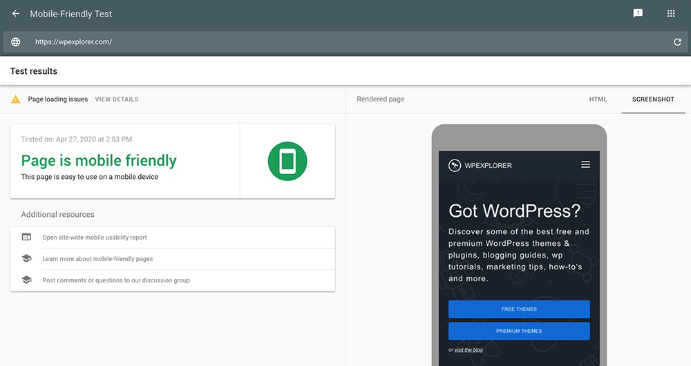
Google has its very own mobile-friendly site tester that gives you personalized recommendations based on what’s missing in your site.
Once you’ve optimized your site for mobile view, it’s time to put it to test. If the outcome is good, you’re good to go! Pat yourself on the back. However if the results are negative, simply work on the suggested changes and you’ll be good to go.
Wrapping Up
Building a mobile site is easy. Building a mobile site that converts isn’t.
Our objective in this article was to show you how you can optimize your WordPress mobile website. Every single study conducted in the field of mobile trends unanimously conclude the fact that it’s only going to grow – exponentially. Google has already started using mobile usability as an important ranking factor.
We’ve been through the list of plugins. Now let’s make sure we’re on the winning side!


May I also suggest you adding to this list ShortPixel Image Optimizer another great tool for image compression?
Good post. I’m searching for the best solution to automatically display content properly for any device.
What about Worona? I have used it to make a mobile app and enhanced mobile web for lots of my wp customers, and we have checked that it also improves SEO. It’s free, although I usually buy some of the extensions to provide push notifications and things alike
Hmmm I’ve never heard of that. I’ll have to look into it!
Hello,
I have started blogging myself. I am trying to find out the basic problems that my blog is having and looking for solutions. Also, I’m searching for some basic things like themes and other stuff.
I have read your whole article, I am looking forward to getting a positive result after performing this myself.
Can you suggest me any basic idea that I might need in the future as a new blogger?
Thank you
My advice would be to stick with it! Most blogs aren’t overnight successes – it takes time to build a solid blog, so just stay focused and create great content 🙂
lscache plugin also helps you with wp optimization.
Its very helpful article for site optimization. thank you very much