How to Use Minimalism in WordPress Web Design

WordPress powers more than 38% of the websites on the Internet. This means that most of the personal blogs, magazines, newspapers, or company presentation websites are built upon WordPress CMS. They use different web designs, some of them, according to the current design trends. One of the stronger and continually growing trends is minimalism in WordPress design. We will take a deep dive into what minimalism is really about and how to use this powerful trend on your WordPress website.
Minimalism is a Modern WordPress Design Approach
Minimalism has influenced the majority of web designs. With art combined with human-computer interaction, minimalism web design has its roots in the early 2000s. However, on the Tate website, minimalism is described as “an extreme form of abstract art developed in the USA in the 1960s and typified by artworks composed of simple geometric shapes based on the square and the rectangle.” Aesthetically, the minimalist design keeps your website’s elements simple, ordered, and in harmony. Functions like transitions, overall composition, navigation, and more can also be seen in popular portfolio WordPress themes or minimal WordPress themes.
A clean WordPress design that allows you to do more with less on your site will definitely ensure a high level of usability. Based on well-balanced elements favoring simplicity, minimalism is one of the modern web design approaches. With a modular system, every element can be moved around and still look great and simple. According to Usability Geek, “simplicity is, ironically, a little more complex to define in the context of web design. It’s not just about the way a site looks; it’s about the user’s overall experience interacting with the site.” Having this type of design on your WordPress website, makes it so your messages and indications will easily guide users.
Best Practices for a Minimalist WordPress Design
With a WordPress theme and a flexible page builder, you can easily create a responsive, unique, and minimalist website. Focus on what your business is all about and identify the elements that characterize it. This will ensure your site is one-of-a-kind, based on your requirements. Below, we’ve made a list of the best practices you can apply to your WordPress website in terms of minimalism design:
1. Negative Space
Use plenty of negative space between elements to guide the readers’ experience towards your product/subject of interest. Furthermore, empty space means design balance, inviting the audience to stay longer on your site. If you are already using a page builder, this is easily managed by adding margins or paddings to builder elements, or by using a spacing module (even Gutenberg includes a simple Spacer option).
2. Hidden Navigation/Hamburger Menu
By using one of these two menu types, you’re ensuring a great UX on your site. This can impact how your site ranks in SERP and even how many of your visitors will actually become customers. Focus on creating menu items for your topics instead of content format. Many of the top WordPress themes include an off canvas or overlay menu style that you can use to achieve this effect.
3. Consistent Coloring
“in most minimalist interfaces, color is used strategically to create visual interest or direct attention without adding any additional design elements or actual graphics.” Minimalism in WordPress websites is mostly shown by monochromatic, grayscale, or by two accent shades. You can pick up the right combination for your website by studying color palettes. Even basic themes often offer built-in color pickers via the Live Theme customizer that you can use to at least add an accent color. But of course page builders will offer your better control over the color scheme of your site, just be sure to use a consistent color palette for your modules.
4. Clear Font Usage
An article on Medium tells us about how the “efficient use of typography can compensate for sparse usage of imagery and animations, making your website visually attractive. Fonts create hierarchy, telling your visitors what’s important and helping them navigate the pages.” You just have to find the right balance between fonts’ weight, height, and contrasting colors to make the overall page appealing and easy to read. Themes typically offer a font selection, however it’s easy to load custom fonts either manually (using a bit of code) or with a plugin. Just be sure to keep the number of custom fonts to a minimum (this is a guide to minimalism after all). In most cases a body font and a heading font are plenty.
5. Concise Details to Emphasize
A minimalist WordPress web design has a well-established role for each element. Imagine that every feature has its own purpose and is there to serve your readers. Don’t get carried away with builder modules or widgets. Giving visitors too many different things to digest will make them confused, and they’ll leave your site before going through all your great content. Along the same line, make sure each page on your website has a clear focus. For example there’s no need to add blog post excerpts to your about page, sticking to your team or company mission statement is more than enough.
6. User-friendly and Intuitive Interface
Think of your website as a map. The homepage is the entry point for visitors, which opens more doors (pages, posts, and so on) that provide useful and interesting information. Be sure to utilize menus and breadcrumbs (which are usually a part of your theme or SEO plugin) to make it easy for visitors to keep track of where on your site they are. A well-done intuitive interface will ensure a pleasant and interactive experience for your readers.
7. Responsive Design
A minimalist WordPress design is easier to be made a responsive one due to the few elements present on it. If it’s not an excess of CSS and Javascript, then, the website should roll smoothly. Today, pretty much every theme is responsive. You don’t have to do anything to activate the feature. Though if you’re lucky your theme will also offer styling for mobile menus or even custom breakpoints so you can really tailor your website to your needs.
8. Visual Harmony
All the information on your site must be organized, grouped into organized sections. Visuals and content have to be well-balanced, divided into logical spheres. Elements on a website can be classified using common categories, such as color, shape, texture, form, space, line, and value. With a flexible, yet intuitive theme and page builder (one example might be the Total Theme with WPBakery, Newspaper theme and the frontend tagDiv page builder, Divi and Divi builder etc), you can easily acquire the wanted layout by dragging and dropping elements. This kind of functionality can be also found in most popular multipurpose themes.
9. Use of Call-to-Action
When you want your visitors to perform an action, you place CTA buttons (Buy Now, Sign Up, Discover, Read More, or Try It Out). These are action messages that, if done correctly, will convert your readers into leads. Ensure the button is clickable, with negative space surrounding it and contrasting colors. Double-check that your CTA button points in the right direction. Again – if you’re already using a page builder (even Gutenberg) there should be a CTA module available. Or at the very least you can use a text module and a button to design your own.
Tips to Highlight Your Content with Minimal Elements
If you’re building your first website, running a personal blog, or designing a portfolio site for your photography business, minimalism web design works perfectly. This way, your content will get all the readers’ attention. Let’s see which are the must-have elements you should include onto your overall website design:
- All the elements should have a proper functional purpose, including colors and backgrounds. Just keep things clean and neat and get rid of clutter.
- Use your own photos or stock images (from authorized sources) that are relevant to the presented content. Use them wisely, only if they are necessary to emphasize the central ideas of the article/page.
- Relevant content should always be placed in the top area. You can highlight this section by using a contrasting color, or an elegant box.
- Use readable fonts.
- You could divide your written pieces into content blocks.
How Minimalism Impacts Your Business

For example, if your lifestyle is minimalistic-based and you have a personal travel blog, you’ll likely try to embed the design trend into your website. Another example refers to your business. If you can present it in a minimal way, you’ll get the most out of your content with this design trend. There’s a connection between lifestyle and design based on minimalism.
If you’ve well-established your goals and created a visual hierarchy on your website, your business will benefit from them. People who enjoy your content will also return to see more, to receive more. Minimalism means functional. A minimal web design adds value to your content, and a perfect functional website is a business success story.
Popular WordPress Minimalist Website Designs
Basically, you’ll recognize a minimalist website design by its few page elements and well-established colors. Pop Web Design shows us that minimalism, dark mode, monochrome, bright color schemes, human-illustration, bold typography, 3D elements, hero images or videos, and animations are the website trends over the years. As a good practice, it’s always a good idea to research the market and the competition. We can turn our attention to big brands that have used WordPress to build their websites and focused on minimal web design.
S’well
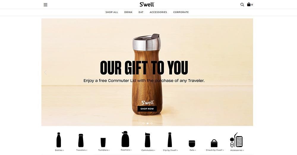
The responsive eCommerce WordPress site for S’well uses minimalism to highlight the one-of-a-kind reusable bottles. The easy-navigation is ensured by a stylish mega menu with suggestive thumb images, as well as a hamburger on the website’s desktop version. The S’well homepage includes an image slider that uses bold fonts and contrasting colors. Right below the slider, there are beautiful and different bottle icon shapes, so you can choose your favorite. Perfect pixel images, custom-made icons, fine typography, and a grid-based layout define S’well outstanding web design.
Toyota
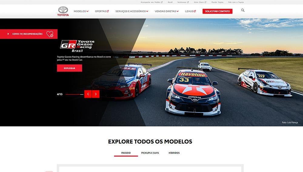
The love for cars sometimes pushes us to develop personal automotive websites. By default, a car is an elegant item, with great built-in features. So, why not use Toyota as a source of inspiration? Black, grey, and red make an awesome color team on this brand presentation website. With a white background and wide sliders, navigation controls and Helvetica fonts, Toyota is an example of minimal WordPress design.
Spark Post

Spark Post has embraced a more modern minimalist design by using geometric figures with orange and grey shades. For a great user experience, the Spark Post website uses a navigational and creative mega menu that guides the users to the wanted category. The footer area is rich in information, with plenty of social media icons, a newsletter box, and page links.
Plesk
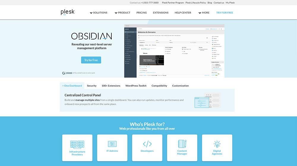
Plesk is a reputable WebOps hosting platform, so keeping things loud and clear right from the start is a must. Characterized with plenty of white space, light blue colors, and right-on-point mega menu, Plesk is designed with minimal touches. Plesk is built using flat line icons and guides you along the page to the most important items of navigation.
Besides the aforementioned websites, you could check out the article on name brands that use WordPress (and why). Furthermore, there are other amazing WordPress websites with minimal designs, shapes, and high-contrasts that can be a source of inspiration.
If you want a minimalist WordPress design for your website, your audience will be thankful. A minimal website is a lot easier to navigate than others, and the negative space sets the focus around important elements. Your visitors will stay longer, maybe turning from leads to conversions (if this what you want to achieve with your site). Everything is thanks to the structure of your site, intuitive UI and the way elements are arranged to provide the most immersive user experience.
If what you’re trying to achieve with your WordPress site is to make it look professional and elegant, then you should definitely turn your attention to minimalist design and its best practices.