Simple Ways to Increase Reader Engagement on Your Blog


The average blogger tends to have an obsession with traffic, and more specifically, getting more of it. Quantity is the key, right? Perhaps, but I often prefer to shoot for the low-hanging fruit by improving the quality of traffic to my sites. This can be done in two ways:
- Attract more relevant traffic (i.e. people that are more likely to engage with your content)
- Do a better job of “selling” your blog to new visitors
In this post I want to focus on the second method of the two, the beauty of which is that you do not have to work to attract any more traffic — you just need to optimize what you already have. In a world that is obsessed with quantity, the concept of improving upon what you already have is often wildly unappreciated.
I recently covered how to create links on your WordPress blog for increased engagement (i.e. the likelihood of any given visitor sticking around) and in this post I am essentially going to take that strategy one step further by offering you a blueprint with which you can increase the “stickiness” of your blog. This should have a directly beneficial impact on your subscribe rates and value per visitor (if your blog is monetized).
Let’s get started!
Sections of Your Site That Increase Engagement
The blueprint is split up into the four sections that most WordPress blogs are made up of:
- Header and navigation bar
- Content
- Sidebar
- Footer
Each section has a part to play in terms of either keeping a visitor on your site or converting them into a subscriber or purchaser and I’m going to explain how you should optimize each one for the maximum beneficial impact.
The first step is to read my previous post on creating links and ensure that your site is properly set up to maximize reader retention. Put simply, no link should take people away from the page they are reading (regardless of whether a link that they click on is internal or external) unless you can be sure that they are done with that page.
With that said, let’s crack on!
1. Header and Navigation Bar
The first question you need to ask is, “Does my site pass the header removal test?” This test (courtesy of Derek Halpern) is simple — just imagine that the header and tagline are removed from your home page and ask yourself if a new visitor can still figure out what your site is about.
If the answer is no then you should probably try to make it more obvious. While it is obvious to you, new visitors generally need to have the message rammed home. One of the best ways to do this is to have a feature box — either directly below your header and navigation or at the very top of your content box. Here’s a great example of a feature box courtesy of Smart Passive Income:
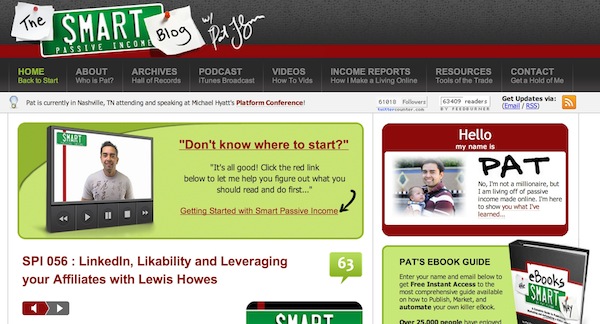
Although the feature box itself doesn’t actually explain what the site is about, it does provide a direct link to a full explanation. It stands out on the page and immediately encourages new visitors to dig further into the site.
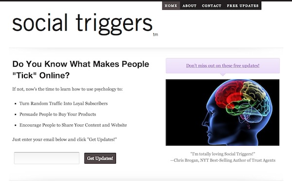
I recommend that all blogs have a feature box — either like the one above (built into the main content box) or a full-width version like this one from Social Triggers:
Once you’ve figured out how you’re going to implement a feature box on your site you should turn your attention to your navigation bar. Generally speaking, your links should be limited to no more than the following:
- Home
- About
- Start Here
- Contact
- Subscribe splash page (if appropriate)
- Product page (if appropriate)
- Hire Me (if appropriate)
Obviously your mileage may vary but the overriding principle is that the links on your navigation bar should point either to high-traffic pages that help people get to know your site better or convert them into a subscriber or customer. Anything else is superfluous and is more likely to reduce engagement than have a beneficial impact.
2. Content
When it comes to any particular page or post on your site, your focus must be on what you can do to keep the visitor engaged. I recommend that you do this by overwhelming them with content options (but in a good way). In a perfect world your visitor can’t help but have multiple tabs open as they browse through your content and click on related links and associated content.
The key to creating this effect is to have plenty of content on your site and link between posts and pages regularly. However, it is vitally important that every link is relevant, otherwise you run the risk of irritating the visitor. If your blog’s focus is relatively tight (and it should be) and you are producing content on a consistent basis, you should have no problem with creating plenty of contextual links within your new blog posts.
But you shouldn’t just stop at interlinking. I also like to provide a selection of related content at the bottom of each post (using the excellent Yet Another Related Posts plugin (YARPP)) along with related tags.
YARPP is a mainstay of most WordPress sites that I work on.
Finally, each post should finish with a Call to Action (CTA) that gives the visitor an option to either subscribe or become a customer. Don’t make the mistake of assuming that your visitors will always notice the CTA in your sidebar or elsewhere — the bottom of a post is a great place to capture their attention. After all, if they’ve read all the way to the bottom of a post they are probably in a good frame of mind to take action.
3. Sidebar
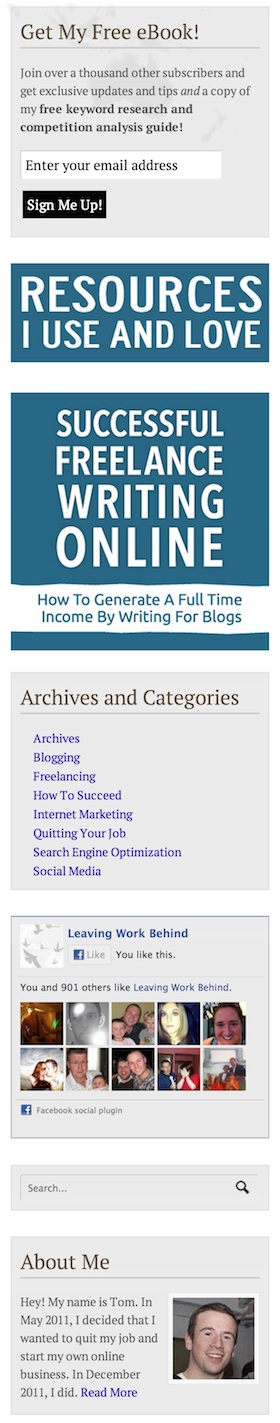
My blog’s sidebar.
The sidebar is perhaps the most abused section of most WordPress blogs. It gets horribly overpopulated with a huge number of low-impact widgets that offer little to the user and contribute even less to the primary aim of your goal (i.e. to attract subscribers and/or customers).
The key to top sidebar performance is for it to be as sparsely populated as possible. Put simply, the less choice a visitor has, the greater the chance that they’ll do the right thing (i.e. complete a CTA). However, you do also want to ensure that the sidebar offers an opportunity for visitors to learn more about your blog and explore further. With that in mind I recommend that you include a combination of the following widgets (listed in no particular order):
- Subscription form
- Link to product (ideally graphical)
- Link to money page(s) (i.e. those pages that generate the most direct income)
- A list of categories/tags or links to resource pages
- Social media buttons
- A search box
- A mini bio box
To the left of this section you’ll see a screenshot of the sidebar on my blog, which incorporates all of the above elements. Each one offers the user an opportunity to explore the blog further, subscribe or purchase. All of those actions benefit you.
4. Footer
To be honest, I include the footer more because it’s an element of the site that you can’t really ignore as opposed to a potential hotbed of engagement and conversion potential. The fact of the matter is that most people won’t pay much attention to your footer and it has limited potential.
A lot of footers limit themselves to simply a copyright notice and to be honest I see no problem with that. If however you want to add a little more oomph to your site then you can populate your footer with a combination of the above mentioned widgets and even more.
WPExplorer’s footer is actually a good example of what you can do with a footer — if a visitor does get to the very bottom of the page then it offers a nice opportunity for them to move onto another section of the site:
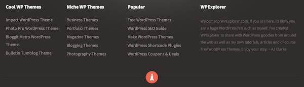
The footer should your be your last priority but if you have the time then you may consider populating it with some engagement-increasing widgets.
Increasing Blog Engagement Summary
I have included plenty of actionable advice above but the most important thing is to understand the fundamental reasoning behind my advice — that the user should always be presented with plenty of contextually relevant opportunities to explore the site further or subscribe. That is the key — so long as you keep that in mind you are unlikely to go far wrong, even if you take a different approach to the one I have recommended.
With that in mind I’d love to know what strategies you employ to maximize engagement and conversions on your blog. Let us know in the comments section below!