How to Create Links on Your WordPress Blog for Increased Engagement


When people hit your blog they generally take one of two actions:
- Bounce straight off
- Start reading
Today I want to focus on that second action because someone who starts to read is at the beginning of a journey that you should take control of. A visitor reading some text on your site does not by itself offer anything of value — the key is to capitalize upon that initial engagement and ultimately get the visitor to carry out whatever primary desired action you wish for.
There are many factors (such as design and copy) that come into play in determining how engaged your visitors are and how likely they are to convert. However, one hugely influential yet rarely discussed factor is the simple hyperlink. The reality is that links are extraordinarily powerful tools and to ignore best practice regarding their creation can result in your blog functioning like a sieve, with each hole representing a link.
In this post I want to help you shore up many of those holes. By following and implementing the advice below you are likely to see improved engagement rates and conversions over time, and from a less tangible point of view you’ll also be improving the visitor experience drastically.
How to Format Your Links
Let’s start with the absolute basics. Each link on your site should be clearly represented as a link — i.e. it should be clearly distinguished from other text on the page and it should be obvious that it is a link.
Back in the 1990s a link was typically blue and underlined like this. People got used to a link looking a certain way and so would get confused if they were confronted by underlined text of the same color as the body text or text that was a different color but wasn’t underlined.
While underlined blue text is still ubiquitous in our minds as a link, these days hyperlinks that aren’t underlined are commonplace and entirely acceptable. However, you should still ensure that your links clearly stand out. Do not leave the user with any confusion as to what is or isn’t a link at any point on your site. And although underlined links aren’t nearly as prevalent these days, it is wise to not underline any text on your site as a general rule unless it is a link. Most people still associate underlined text on the web with hyperlinks and as such it should be reserved only for hyperlinks. If you want to emphasize text use bold to highlight key phrases (e.g. this is really important) and italics to suggest inflection in the vocalization of a word (e.g. I really want you to read this).
Anchor Text
For those of you who don’t know, anchor text is simply the words used in a link, the most common of which is “click here”. Anchor text is enormously important for a number of reasons (WordPress search engine optimization being an obvious example) but in this post I want to focus on usability, by which I essentially mean the ease with which someone can understand what a link leads to before they click on it.
Internet users are for the most part quite savvy these days and as such do not need their hands holding in the same way as they did 10-15 years ago. It is no longer necessary to preface every link with “click here” anchor text — instead it is far more helpful to the visitor to be descriptive, and far better for the “flow” of text to incorporate links intuitively. For instance, consider the following two anchor texts:
- To find out more about our products click here.
- Find out more about our products.
The second anchor text stands out more, is easier to understand and easier to click on. In a nutshell it is far superior to the “click here” alternative. You should always strive to include contextually relevant anchor text on your blog.
In terms of presentation, it looks neater to exclude punctuation marks from anchor text. Furthermore, it is important that you remain consistent in the manner in which you exclude punctuation marks from anchor text, as doing so will make the user experience more predictable and more pleasing.
Title Text
There are essentially two elements that describe a link and help users to decide whether or not they should click on it. The first (and most important) is the anchor text but one should not ignore the value of title text.
In most desktop browsers link title text is the little popup text that appears when you hover over a link (for which title text has been defined):
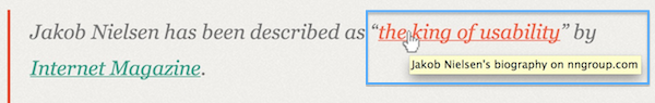
If anchor text provides context, title text provides clarification. The example above is a perfect one — the anchor text and surrounding body text leads us to believe that the link leads to something relating to (a) Jakob Nielsen and (b) his reputation as “the king of usability”, and the title text clarifies that the link leads to a biography hosted on a specific website. It would not have been practical to include the title text as anchor text but it serves as useful additional information.
So use title text whenever it is appropriate. You do not always need to use title text — for instance, in a situation where it is entirely clear from the anchor text where the link will lead. Here are two common examples of just that:
In my recent post on WPExplorer, “The Periodic Table of WordPress Plugins (and My Top 5)“, I listed my top 5 plugins out of the 108 most downloaded on WordPress.org.
The first link’s anchor text includes the headline of the post that is being linked to. The second link’s anchor text provides the name of the website to which it links to. In either case, there is no real benefit in repeating the anchor text as title text or including what would most likely be superfluous information as title text.
If you want further examples of effective use of title text just hover over each the links in this post. Some have no title text (and it should be apparent why), while others do.
Opening Windows in New Tabs (Or Not)
When it comes to web usability I have found that the question of whether to open links in new tabs is often a point of contention. Having considered the issue at great length my viewpoint is as follows: whether or not you should open links in a new tab is entirely dependent upon the link.
Let me explain my viewpoint by asking you to consider what value there is in a link opening in a new tab. If a link opens in a new tab the web page that the user was originally on remains open and the screen remains at their last position on the page. Therefore, if you have cause to believe that someone might wish to explore a link on your blog but return when they are finished with their diversion, you should open that link in a new tab.
On the flip side, if you have cause to believe that a particular link represents a clear route away from the existing page, it makes sense for that link to open in the same tab.
To give you examples of what links should be opened in existing or new tabs, let’s take another look at the title text example I used above:
In my recent post on WPExplorer, “The Periodic Table of WordPress Plugins (and My Top 5)“, I listed my top 5 plugins out of the 108 most downloaded on WordPress.org.
Both of those links open in new tabs. Why? Because they both represent temporary diversion from this post — links that you might choose to explore before returning to read the remainder of this post. You might similarly choose not to explore them at all. Either way, they open in new tabs so that you can return to this post with ease when you are ready to.
Now take a look at the following image:
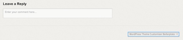
This is a screenshot of the bottom of a recent WPExplorer post, at the end of the comments section. The link at the bottom right of the page should open in the existing tab. Why? Because the user has reached the end of the page and as such has likely digested the contents of the existing post and is ready to move on. This is just one example — links that should open in the existing tab can in fact be at any position on a site. Other links that should open in existing tabs include navigational elements (a top navigation bar or categories list, etc) and Calls to Action (like a newsletter subscribe box).
One popular argument against this approach is that the choice of whether or not to open in a new tab should be left to the user. In an ideal world that would be the case, but there are two reasons why it is not:
- Not all users are savvy enough to open links in new tabs when it is appropriate for them to do so.
- Even the savviest user may mistakenly open a link in an existing tab when it would have been better for them to have opened it in a new tab.
That’s just about everything I have to say on the topic of links — if you implement the above guidelines on your blog I am confident that you will see a jump in popular engagement metrics such as time on site, bounce rate and average actions per visitor. Not only that but visitors to your site will enjoy a far more intuitive user interface in the form of clearly labelled and described links that direct them appropriately.
The key is to always bear the visitor in mind — making the experience of browsing your site a joy should always be the top priority. Don’t take shortcuts like blindly opening all links in new tabs or rushing the way in which you format links — work to assist the user (rather than frustrating them) and you will reap the rewards.


Tom,
Nice reminder for all bloggers on how to write neat and more useful posts.
However, I disagree with you stance on “to open in a new tab or not” matter. From UX point of view, it’s clearly not a good practice to be inconsistent; surprises are not welcome here.
I suggest you choose one. My personal preference is “all links open in existing tabs”. It’s up to users to do what they want.
Hey Dragan,
I appreciate where you’re coming from but we have no control over the entire user experience. Each new website that a user visits may or may not open windows in new tabs and we cannot affect that. Therefore, my priority turns to a logical decision as to what is most beneficial to the user for any given link which is why I go with the strategy above.
If we existed in a world where all other links the user visited either did or didn’t open in new tabs I would side with your viewpoint, but that’s never going to be the case.
Cheers,
Tom
Hi, nice post! About link title, it reminds me to an article that written by David Ball when he is pretending to be a blind for a week. He said ‘Link titles aren’t helpful’. What about you?
Oh yeah, I remember reading that article it was very interesting. It’s crazy that most people don’t even consider useability when writing articles.
The rule of thumb for any site is to make content engaging and as in ecommerce sign pointing things to guide a user / customer to do what you want them to.