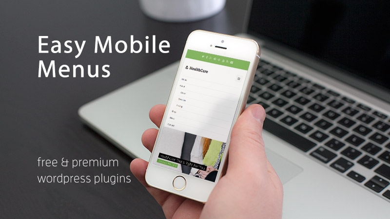
Mobile Responsive Menu Plugins for WordPress
Mobilegeddon might have been and gone. However, even if your website survived this latest Google update unscathed, there is always more you can do to make your mobile visitors feel at home on your website.
A responsive or even mobile-first WordPress theme is a great way to accommodate the growing number of internet users who access online content on smartphones and tablet devices. However, even if your website is mobile-friendly, there are a few tweaks you can carryout to make it even more so.
One particular area of your website which has the potential to frustrate visitors who are accessing it on a small screen device is its navigational menus. If you’ve ever tried to access the different pages of a website on your smartphone, via an unwieldy drop down menu, or an overpopulated header navigation system, then you should be able to relate to this pain point.
So to help ensure your website isn’t making this fundamental mistake, and scuppering the attempts of your visitors to reach the inner pages of your site, we are going to be looking at some plugins that can help you create custom menus for mobile users, that also integrate seamlessly with the rest of your website. We’ll also be looking at some tips to help you ensure your menus are as mobile-friendly as possible.
Advice for Making Your Website Menus Mobile-Friendly
Before we get to the actual tools that can help you make your website menus more useful by mobile visitors, let’s take a quick look at some usability tips for better catering to mobile-users:
- Reduce the number of menu items: to better accommodate small screen devices, try removing non-essential items from your mobile-only menus.
- Position the most wanted links front and center: depending on the purpose of your website, there is a good chance mobile users are looking for a specific page – this could be your address, opening hours, or contact details – help them out by putting these links in a prominent position.
- Minimize the amount of clicks required: the majority of mobile visitors want access to the information they seek in just one or two clicks, so try limiting the layers of your menus.
- Maximize screen real estate: nested or expanding and contracting drop down menus are a great way to avoid your menus taking up too much screen space. Use the universal three line ‘nav burger’ icon to signal the menu location, or better still, use a context sensitive tab bar.
Back in 2012, 55% of respondents in a survey by Google stated that a bad website experience on a mobile device would hurt their perception of the brand; so if you aren’t doing all you can do make your website as welcoming to mobile-users in 2015, who knows what damage you could be doing today.
Hopefully you can now see the importance of making your website menus more mobile-friendly. By using some common sense and the above tips, you can ensure you aren’t putting off mobile users, and are instead delivering a positive user experience to your visitors.
By using one of these free or premium plugins, you can make your website’s navigation system more user friendly and easier to use.
Responsive Menu (Free)

This free plugin allows you to change many aspects of your website’s mobile navigational menu, in order to make it more usable by smartphone and tablet using visitors. Your original website menu remains intact and accessible by non-mobile users.
The list of options for customizing the menu is very extensive. With the plugin enabled you can edit the titles, colors, size, position, order, and many other attributes of your menu to make it more mobile-friendly.
The Responsive Menu plugin also makes it easy to hide your menu until the user clicks on the icon to reveal it. You can use the standard three line, nav burger menu, or upload an icon of your choice. You can also choose the slide out direction of the menu, to ensure better compatibility with the design of your website. If you are looking for a flexible option, this popular and well-regarded plugin is a good choice.
WP Responsive Menu (Free)
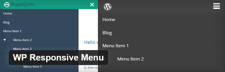
WP Responsive Menu is another free option for adding mobile-friendly menus to your WordPress website. Although this plugin will work with any theme or framework right out of the box, you can customize its appearance to better suit the design of your website.
Through the settings you can also add your logo to the menu, choose the slide out direction, and hide unnecessary menu items from mobile-users. You also get the option to enable or disable pinch to zoom on your menus, depending on your preferences. There is also a premium of this plugin available if you’d like access to additional features.
UberMenu
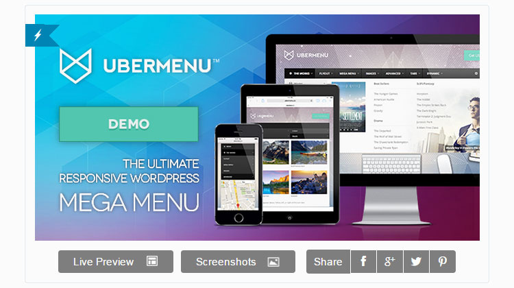
The premium Uber Menu plugin lets you do some pretty amazing stuff with your WordPress website menus. Even your desktop and non-mobile visitors can benefit from the features of this plugin.
With this tool installed on your websites, your menus can now contain a range of different types of content, including images, forms, maps, and icons. Every aspect of your menus can be customized with this plugin, turning them from simple navigation systems, into a personalized extension of your website.
A particularly nice feature of this responsive menu builder plugin is that all the personalization of the menus takes place through the WordPress Customizer tool. This gives you a live preview of your work, saving you both time and effort.
Although the UberMenu menus are responsive and mobile-optimized by default, you get a lot of additional control over how your smartphone and tablet users will experience your navigational systems. This includes configurable breakpoints, enhanced touch support for Android, iOS, and Windows 8 users, and items being hidden depending on screen-size.
UberMenu is a great value premium menu builder plugin that can help take your website navigation to the next level (plus it comes with a superior level of documentation, support and regular updates not guaranteed by the free options above).
As you can see, adding a mobile-responsive menu to your WordPress website, or upgrading your existing menu is very straightforward. By using one of the above plugins you can carry out this task without having to edit any code, change your WordPress theme, or directly modify the way it works.
While there is more to making your website mobile-ready than just optimizing the menu, it’s a great place to start. The navigation system of your website is perhaps its most important feature, so ensuring it’s suitable for the growing number of mobile users is essential.
If you want more advice on making your website mobile-friendly, check out this article on mobile-optimization tips for WordPress or this one on mobile ready WordPress themes & plugins.
What most annoys you about using website menus on your smartphone or tablet? What features would you like to see in a mobile-responsive menu plugin? Please share your thoughts in the comments below.


Awesome this is great Wonderful information.. Awesome thanks.
Hi Joe,
Great post indeed. Customizing a WordPress website is always a charm for me, and especially when it is about a mobile website, then responsiveness is the core requirement.
Thanks for sharing your professional experience.
Nice…
Such a Great Article.
Thanks for sharing this with us.
Just thinking you might be interested this plugin also – WDES Responsive Mobile Menu