5 Optimization Tips to Make a WordPress Site Mobile Ready
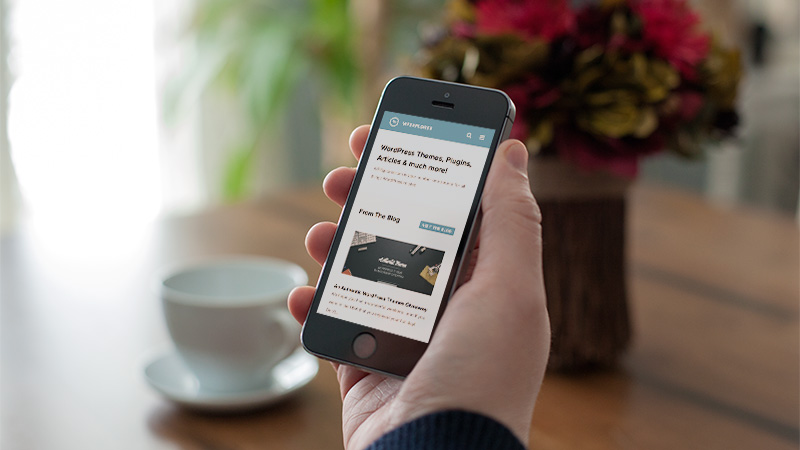
More and more people are using smartphones and tablets every day all over the world. In fact, it’s estimated that by the end of this year, more people will be using their mobile devices to search the web as opposed to desktop internet. All the more reason to make sure your WordPress site is mobile-ready, right? Fail to recognize the strength of the mobile market, and you certainly will miss out on opportunities big and small to reach a larger market of consumers.
Luckily for you, it’s not as technically challenging as you might first think to optimize your site for mobile use. Take a look at the following tips to get your WordPress website up to par with the rest of the mobile-ready web.
Why Does Your WordPress Site Need to be Mobile Ready?
Look around. Just about everyone is carrying around some brand of mobile device. Even kids have them nowadays. Since most people own a mobile phone, chances are they’re reading someone’s blog or website on it. Why not yours? You’ve probably already done your due diligence when it comes to driving traffic to your website, like building up your SEO efforts, for instance. Well, wouldn’t you know it that mobile device optimization falls under that category?
You’ve got to use every channel to get as much traffic as you can. Considering the fact that about 2.7 hours is spent perusing social networks on mobile phones every day by Americans, chances are they’ll be coming across a bunch of different blogs and sites that their friends share.
You always have to be on your toes when it comes to the world of technology and marketing. With scores of people using mobile devices, it’s important for website owners to identify a new avenue for marketing their websites to generate new traffic. And the best way to do that? Mobile optimization, of course! Are you sensing a trend here?
If your site is not optimized to be viewed on a mobile device, it will be tough for your viewers to read your content and view your images. A website needs to be properly optimized specifically for use on the screen sizes that mobile devices have. The screen size and resolution need to be just right. If not, your visitors will find a different website to go to. Over time, this can cost you potential customers.
You want your site to generate traffic. But once they’re there, you want their experience to be a positive one. Having a site that’s ready for mobile use will improve your visitors’ experience and increase your chances of turning them into repeat customers.
Tip #1: Use Mobile-Friendly Themes
In order to keep the theme of your website consistent between desktop and mobile versions, a mobile theme is perfect for you. This way you don’t have to develop one yourself or have to hire someone to do it for you. Along with the increase in mobile device use also comes an increase in the number of mobile themes available. Funny how that works out, huh?
Here’s a few to check out:
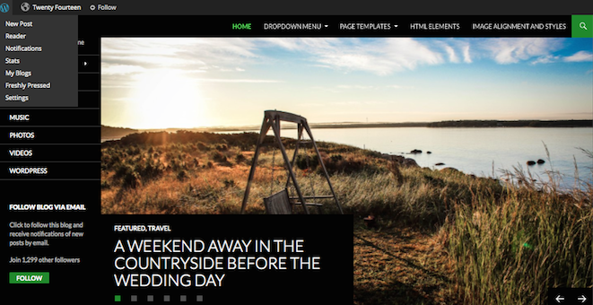
- Twenty Fourteen. WordPress’ default theme is actually ideal for many websites. It’s responsive, attractive, and offers numerous menu configurations to fit on any-sized screen.
- Total theme. This top selling theme is a great way to display your website across a variety of mobile devices. Total is fluid responsive, so your page layouts automatically adjust to the browser window. Plus added custom mobile options make it easy to optimize.
- Pineapple. This minimalist WordPress theme is amazing as a theme, which makes use of a mobile responsive design.
- Mayashop. If you’re operating an e-commerce site, the Jigoshop plugin is a great option that works seamlessly with the Mayashop theme. E-commerce sites tend to be a little more challenging to optimize for mobile devices. This theme will help to suit your specific design.
Tip #2: Use Plugins
One of the best things about WordPress is the availability of plugins that make the website owner’s job much easier and more streamlined. Plugins serve a ton of purposes, including helping to make a site mobile friendly.
As a site owner, you’d rather spend your time and effort concentrating on the actual content on your site than all the technical mumbo-jumbo that goes on behind the scenes to make your site function, right? A simple plugin can help to make the content on your site easy to read without having to zoom in a million times or scroll from left to right when trying to read through a paragraph on a phone.
Here are a couple of plugins you might want to check out:
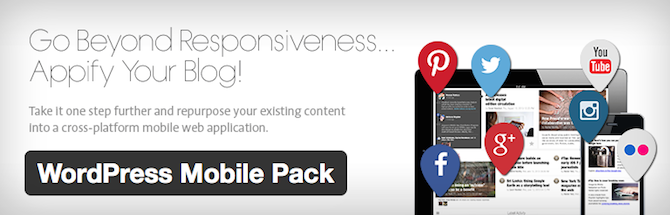
WordPress Mobile Pack. This plugin gives you total control over your website’s mobile version. Domain mapping makes it easy to identify the most popular devices, with a single theme offered in four different color palettes.
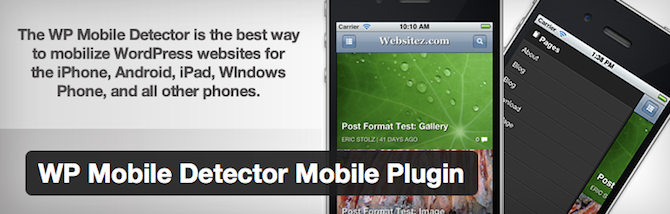
WP Mobile Detector. This plugin provides a simple way to optimize your site for mobile devices in no time at all. WP Mobile Detector works with thousands of different smartphones, tablets, web-enabled phones, and so forth, giving your visitor a pleasant experience without you having to spend weeks trying to figure it all out yourself.
Tip #3: Make Your Site Responsive
You’ve most likely visited a responsive website in the past. These types of sites respond appropriately according to the device it’s being viewed on. When being viewed on a desktop, the site is presented one way. When being viewed on a smartphone, it’s presented in another. The same thing happens when viewing the site on a tablet or laptop, or any other mobile device you can get your hands on.
Having a responsive design to your site simply means that it will be customized automatically, no matter what source your viewer is visiting from. Pretty cool, right? Having a responsive website is easy as pie if you’re using WordPress as your site’s platform. All you have to do is find a responsive WordPress theme to suit your website’s style (we can’t stop talking about our fully responsive Total WordPress theme with built-in drag & drop page builder, so you can create any responsive layout you want!).
Tip #4: Minimize Elaborate Graphics
Think about the size of a mobile device’s screen. Granted, they seem to be getting bigger every day, but they’re certainly smaller than the average desktop. Forget filling your website with fancy graphics – too many of them will just cause load times to increase, which is a no-no for mobile surfers.
This is particularly true for e-commerce sites. Shoppers don’t want to be bombarded with graphics to have to sift through. They want to be able to make a purchase quickly and efficiently. So veto the excess graphics and keep it simple.
Tip #5: Choose Text Wisely
In addition to minimizing graphics on your website, you’ll want to minimize text too. Visitors have very limited space on their screens to check out what you’re selling or writing about. Since they’re not likely to zoom in and out or scroll up and down, keep your text razor-focused on what your product is all about.
Forget about all the ‘frills’ that many sellers try to use to garner more attention to their products. Give shoppers only what they need to make an informed purchase.
Optimizing your WordPress site for mobile devices doesn’t have to be complicated. But it has to be done, no matter what. As a savvy online entrepreneur, you already know that. Anyone with a pair of eyes can see how the mobile world is taking over. So, hopefully these tips will prove helpful.
Have you already made your website mobile friendly? If so, what steps did you take to accomplish this? I’d love to know!


The TwentyFourteen Theme is very simple, and easy on the eye. I’ts also easy to maneuver on you’re mobile phone,not too long of a loading page time, i think its unique to say the least.
Can I get permission to share your article(s) on my blog? If so, how do I go about getting permission?
You are more then welcome to link to any of our articles, but you can not copy our content.
Thanks, Tom. Very helpful. Many people will be familiar with the very powerful and well-regarded Jetpack plugin, which also has a mobile device feature. For those who are not, I thought I’d give Jetpack a mention. I’m not affiliated with Jetpack, but find it to be an excellent plugin.
Very nice article. I am using de-tube theme on my WP website. How can I make it mobile friendly ?
Hmmm – if you’re using the De-Tube theme from Themeforest, then it’s already responsive. Your site should work just fine on mobile devices. If you’re having issues with it though make sure to contact the developer via the Themeforest comments section on that theme.
Hi Kyla,
Thanks for the support. The problem has solved. I updated the theme to newer version and now my website is running fine.