5 Tips to Boost Form Conversions for WordPress


Whether you want visitors to make a purchase, sign up for a demo, or download a white paper on your website, you’ll need to create a website form for that process.
The design, messaging and functionality of your web forms play a large role in whether a visitor completes the form and converts. Making these small adjustments to your WordPress forms can help you reduce the cognitive load for a visitor and boost form conversions.
In this guide we’ll be sharing tips for Gravity Forms and the free Contact Form 7 plugin. These can all be completed with Gravity Forms’ core features and settings, or if you’re using Contact Form 7 with a few free and premium addons. But really any of the tips can be applied to most top WordPress contact form plugins. So let’s get started!
1. Utilize a Strong Color Contrast in the Form Design
When a web visitor lands on your site, they are typically looking for the fastest & easiest way to achieve a goal, whether to get more information or make a purchase. One way to increase form conversions is to make the form design & layout easy to review for all visitors.
A common mistake on WordPress sites is to set up a default website form design with a white form background and thin gray boxes as form fields.
Consider instead creating a form design where there is a strong color contrast between the form background, the form labels, and the white form fields. When selecting the colors for your form, follow the WCAG guidelines on color contrast with a contrast ratio of at least 4:5:1. This helps any visitors with a disability or visual impairment clearly differentiate the form fields from the background color of the web page.
You can refer to the Gravity Forms developer accessibility guide as a resource. This guide really has everything you need to know about accessibility and Gravity Forms, including a whole section on color contrast and use of color.

If you are utilizing the free Contact Form 7 plugin, the Accessible Defaults extension can help you implement accessibility best practices on all your forms.
2. Reduce the Number of Optional Fields
Long website forms can deter conversions as they often take a longer time to fill out. When a visitor encounters a form, they are subconsciously calculating whether the effort it takes filling out the form is worth the benefit that they’ll receive.
In general, reduce the number of fields as much as possible. If you need to include a few optional form fields, clearly label the required versus optional fields in order to reduce user errors when submitting the form.
In the paid Gravity Form plugin, form fields are optional by default and you can check off the “Required” option when editing the form in the WordPress dashboard.
For the free Contact Form 7 plugin, adding an asterisk in the form field HTML is the best way to identify a text field as required.
With long web forms, web visitors also have to consider whether they want to share all of that personal information. Consider adding a link to your privacy policy on the web form and following the GDPR best practices for data protection in order to establish trust with potential customers.
3. Consider a Multi-step / Multi-Page Form
If you need to have a long form on your website for an in-depth registration process or application, consider converting it into a multi-step or multi-page form.
By breaking up a long process into small steps, the perceived effort is reduced and this encourages more web visitors to begin the process. With multi-page forms, it’s helpful to set up a progress bar below the form on each page and this will indicate where the visitor is in the process while filling out the form.

If you are utilizing the paid Gravity Forms plugin, you can utilize the built-in plugin options to create a multi-page form and group the form fields by page. Use core options when adding fields for “begin paging” “page break” and “end paging” to create your own multistep forms.
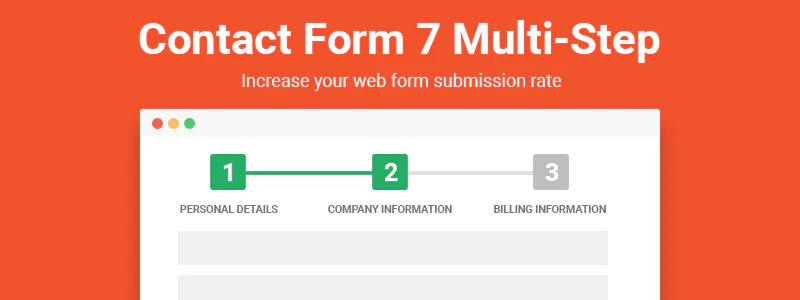
There are also paid plugin extensions for Contact Form 7 that allow you to add a multi-step form process on your site. Multi-Step pro enables you to break up long forms into a step by step process.
When setting up the different pages of the form, consider the user experience as someone goes through the form. Start by requesting basic information and try to group similar data together. This can reduce the amount of effort and create a smooth flow to the form.
As always, be very careful requesting any confidential information, such as health information or financial data through a simple website form.
4. Automatically Format the Data in Form Entries
Some form fields may require a specific format, such as phone numbers, dates and credit card numbers. By automatically formatting the form field entries, you can speed up the process for web visitors, getting them to convert faster.
In Gravity Forms, you can select either a US or International phone number format style when setting up a phone field.
If you don’t want to limit visitors to a specific phone format, you can also consider providing an example of the data entry as the placeholder text of the form field. This can help visitors to quickly determine the correct format for dates or addresses. In Contact Form 7, you can include a placeholder watermark in the HTML code for a number field to do this.
However, avoid using placeholder text in lieu of form field labels. This is an important web accessibility practice as the placeholder text disappears when you click into the field and some visitors may need the label as a reference. People are also multi-tasking while browsing on the web, so you need to make the steps as clear as possible given that their attention may be distracted.
All of these steps will help web visitors complete the form correctly on the first submission. Most people won’t try to re-submit a form more than once or twice if they keep facing submission errors.
5. Avoid Misleading Calls to Action
Misleading calls to action can hurt conversions. Remember that a web visitor is assessing subconsciously what benefit they’ll receive from providing their information in the website form.
A call to action or CTA is the messaging on your website that prompts someone to take an immediate action. Some common CTA examples are Request a Demo, Get a Free Consultation or Add to Cart.
There is a balance between reducing the fields on a form and requesting enough information to meet the client’s request. If you promise to deliver a calculation or estimate, the customer will expect you to request enough information in the form in order to instantly provide that request. If all of those fields are missing, the web visitor may think the form is misleading and instead of being delivered a calculation, they’ll receive a call from a sales person.
In addition to the form messaging, review the thank you page or confirmation message that a visitor sees after submitting the form. The messaging should provide a positive user experience by confirming that their form submission has been processed.
Setting up a specific thank you or confirmation page for each form can also assist with conversion tracking in analytics.
With Gravity Forms you can define a “Redirect URL” under Setting > Confirmations when creating your form.

For Contact Form 7, the free add-on Redirection for Contact Form 7 adds the option to redirect a user once they’ve successfully submitted the contact form.
WordPress Tools for Form Conversion
From the color contrast to the field entry formatting, you can boost the number of form conversions on your WordPress site. By harnessing different WordPress tools and following UX design best practices, you can increase the odds that a visitor will put in the effort to submit a form on your website.