4 Tips to Improve UX on Your WordPress Website

When it comes to creating a popular (and profitable) website, your primary focus should always be on the user experience.
That should go without saying, and yet so many webmasters seem to ignore what many consider to be the golden rule of website creation. With the greatest of respect, if you’re not putting your users first, you’re crazy.
And that leads me to the topic of this post: the myriad ways in which you can improve the user experience on your WordPress website. Below we address some specific common mistakes made by many webmasters (and WordPress users in particular) and show you what you should be doing in order to encourage people to return to your site again and again.
The Basics
First of all, let’s talk about the three things you need to get right in order to create beautiful user experience:
- Design
- Usability
- Content
If you have a beautiful-looking site that is easy to navigate and features great content, you’re golden. All you need to do then is focus on a stellar marketing campaign (but that’s a whole other topic for another time). While listing the above three requirements is simple enough, executing them in practice is another story altogether.
The following actionable tips all focus upon design, usability and content. If you take nothing else from this post, recognize that your focus should always be on those three things when it comes to designing, maintaining, optimizing and updating your WordPress website.
Alright – let’s get down to it!
1. Make Your Design Clean and Simple
Bad web designers are often more concerned with creating something that’s pretty rather than functional. The fallacy of this approach is profound – a visitor almost always prefers function over form. When designing a website, the main question you should always return to is, “Will my site confuse visitors?”
Unique and intriguing designs may win awards, but by their very nature are typically a usability nightmare. Why? Because people like predictability. They expect to see certain elements in certain places, and when they don’t, they get confused and frustrated. Then they leave.
You can use vector icons, which are usually made of simple geometric shapes like circles and squares, rather than photographs. But be sure to include some text so visitors know what the icon means! Most people won’t see your site as a work of art; they just want information (and fast).
There is absolutely nothing wrong with a standard blog layout (a header, followed by the main content and a sidebar, followed by the footer). And in reality there is a lot you can do with standard layouts to make them striking. Hubspot is a great example, as they take the standard blog layout but add in unique lists (e.g. popular posts, editor’s picks, a bold newsletter signup, etc):
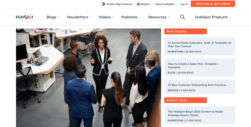
Clean and simple, yet striking and beautiful. It represents great balance between form and function. It’s exactly what you should be looking for.
2. Make Navigation Easy and Obvious
Navigating through your site should be absolutely effortless for the end user. They should be presented with one or more navigational elements that makes it easy to find what they are looking for. Many easy to navigate websites implement one or many of the following:
- A navigation bar (practically essential)
- A categories list in your sidebar
- A search box in the sidebar
- An Archives page
- Breadcrumbs
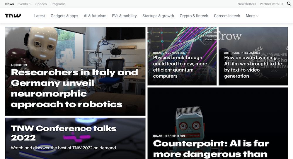
Use WordPress’ powerful custom menus feature (found under Appearance > Menus in your WordPress dashboard or via the live customizer) to arrange and name key pages. By default page names will be displayed as-is in your menus, but you can customize them like the folks over at The Next Web:
While WordPress does have search functionality built-in, it is fairly basic. So using a solid plugin like Relevanassi or SearchWP is a great choice, as this will not only give you more control over how your search functions but it will also improve the overall experience for your readers.
As for an archives page, this is again something that is a part of core WordPress – you just need to put it to use. Archives are pages that organize your content by different qualifiers. For example, there are archives according to date, category, tag, author, etc. Here’s the author archive page for Kyla on WPExplorer:
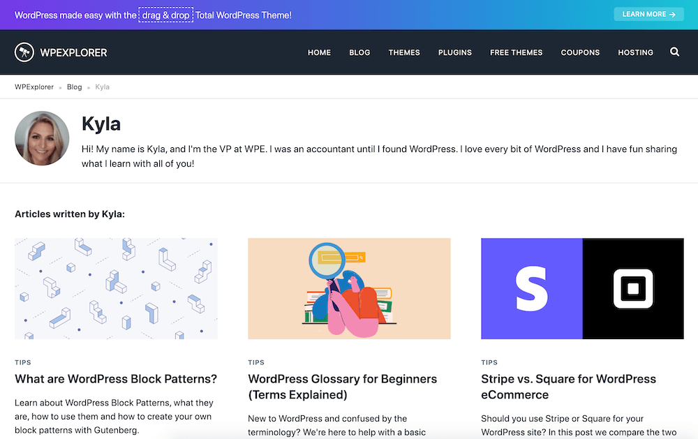
Of course, presenting options like this is only helpful to the end user if you categorize, tag and otherwise organize your content effectively.
Finally, breadcrumbs are a great way for visitors to see where they are on your site and immediately find their bearings. It shows the layers of your site sections, categories, tags and finally the post or page that the user is viewing. Using WPExplorer as an example again, here is how we have ours setup at the moment:
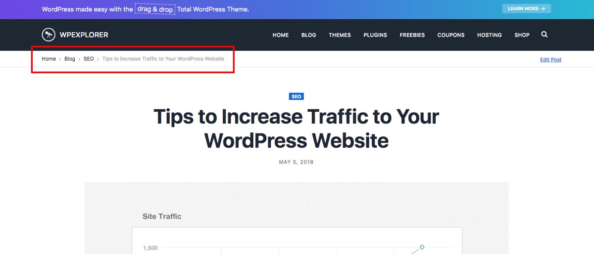
Integrating breadcrumbs within your site is easy – just use the Internal Links feature included in WordPress SEO by Yoast (our favorite SEO plugin and what we use for our site).
The common theme running throughout the above examples is ease of navigation. A lot of people will leave a site after seeing just one page. Your job is to give them an easy option to continue exploring. Effective navigation helps you to do that.
3. Give Them a Place to Start
Unless you have a post that goes hugely viral (and even then), you’re likely to find that your homepage is by far the most visited page on your site. The reason for that is twofold:
- It is an obvious entry point and will be linked to from other sites more often than any other page.
- It is a likely next step for people to click on when they first visit your site through any page.
Therefore, you can increase the user experience drastically by giving new visitors a helping hand in terms of demonstrating how your site can benefit them. There are two ways to do this.
The first is a feature box. This should be displayed prominently at the top of your site and give the visitor an instant idea of what you have to offer. It can also serve as a high-converting opt-in form, like the Wired ad for their conference at the top of their page:
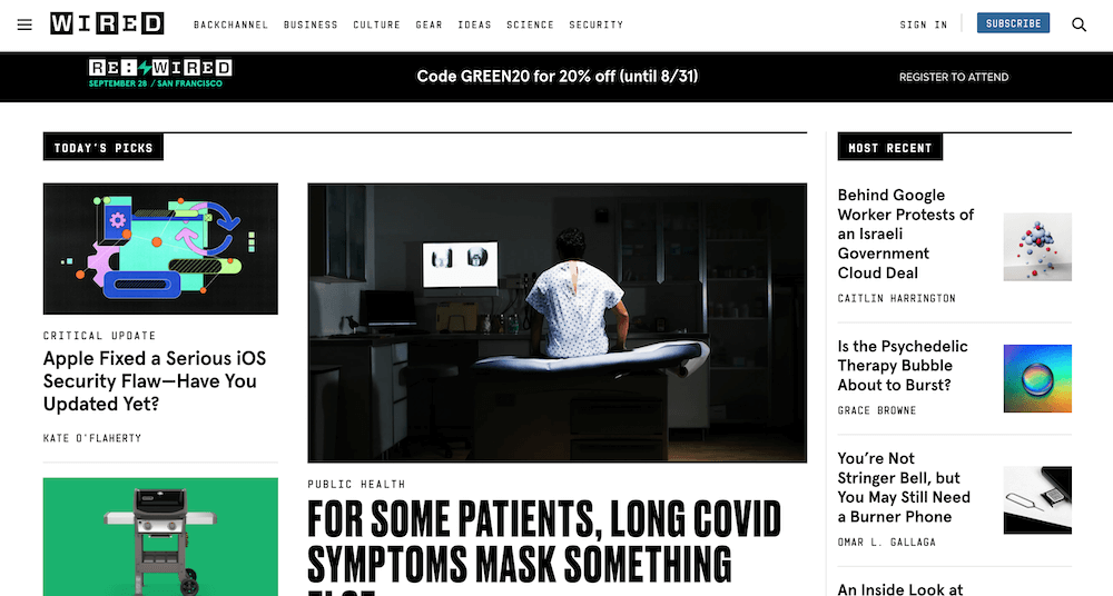
With a well put together feature box in place no visitor will be left confused as to what your site has to offer. When compared to a linear home page that just features the most recent blog posts and similar elements, it is a huge improvement in terms of the user experience.
The second thing you can consider is a Start Here page. The purpose of this page is simple: to clearly outline the benefits of your site and give people actionable next steps in order to progress. Now, this might not make sense for every type of business but if you offer a guide or a service it could help.
Like the feature box, you can use a Start Here page to achieve a double whammy effect: get people more engaged with your blog and send them to the pages on your site that are most likely to result in a conversion and/or sale.
4. Make Your Content Look Good
Us web folk are a pretty fickle bunch. We’ll often value content more highly when it made to look better. Here is an example from our friend Tom:
“I personally realized the effects of this just recently when an old article of mine was syndicated in an iOS magazine. It went from looking like this:
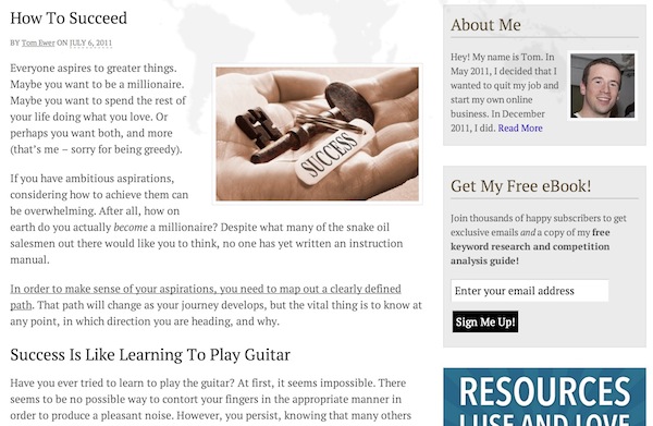
To this:
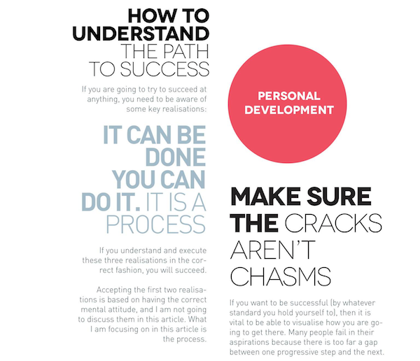
I felt compelled to re-read the article that I had written purely on the basis that it looked more interesting.”
There are two ways in which you can make your content more engaging for the user (beyond actually writing better content):
- Design, typography, etc.
- Formatting
WPExplorer is a great example of how typography can be used to provide variety and interest to plain text, with its orange headers and easy-to-read sans serif font. In terms of formatting, that’s up to you on a post-by-post basis. Consider the following:
- Short Words, Short Sentences and Short Paragraphs: make it easy on the reader.
- Sub Headers: use liberally and make them descriptive.
- Bold: highlight key passages.
- Italics: emphasise certain words.
- Images: use liberally to add color and variety.
- Other Graphical Elements: use lists, tables, blockquotes, and anything else that will add a little spice to your content.
Creating compelling content is not just about the content itself, it’s about how you present that content and make it seem more compelling.
What Next?
If you nail the above concepts then you’ll be well on your way to having a thoroughly engaging website. Although we have included what we believe to be some of the most important considerations for a positive user experience, there is of course always more you can do that we have not covered.
With that in mind, we would love to read your suggestions in the comments section below. What other measures do you think webmasters should take in order to create the best possible user experience for their visitors? Let me know!


Good points. I’ve tried so many times to try and nudge other site owners I know to hire me to spruce their site up because they were following none of the guidelines you just listed. To be honest their sites are ‘janky’. Maybe sharing your tips followed by a little self promotion to help is in order.
Thanks for the inspiration.
How did you create your Archives page?
I created a custom template. The date archives are manually created (i.e. just hyperlinks), and I used the following two PHP functions for the categories and tags:
Then I just used CSS to style them appropriately!
I’ll try that again! Wrap the following in PHP tags:
wp_list_categories( ‘title_li=&hierarchical=0&show_count=0’ );
wp_tag_cloud();
The emphasis on ease of navigation for user is always greatly overlooked and I would second that as a very key aspect for any site… Get users to the content they want, as fast as possible.
That is come amazing resource to look forward to. I have been wanting to do podcasting for my own blog but need some help with the resources required to do one. I will be glad if you can help in that matter.
This information is rocking .. thanks for that.
Sneha
This post on how to Host a PodCast with WordPress may help.
post is very useful for many people, especially for beginners who are still dear,, I am very happy to visit this blog.
Thanks Kata!!
Thanks Tom for this post! It was helpful for me to build my site design more user friendly!