Creating Effective Forms in WordPress


Information is critical for any business and is even more valuable if it’s coming straight from the source – your customers. One easy way of collecting data from your customers is by creating an online form and encouraging them to fill it in.
It is no secret that forms are useful tools for businesses and 50% of marketers say that a lead generation form is their major way of acquiring leads. Online forms have become so popular that there are a variety of form builders on the market specifically made to cater to any use cases one may need. This type of software allows users to create a form easily, and are generally no-code platforms.
WordPress is one of the most popular CMS platforms for businesses to use to create their websites, and whilst WordPress has many strengths, it is not designed to create forms by default.
One of the many benefits of WordPress, however, is that it offers hundreds of integrations. That means that if WordPress is unable to do something, it will offer a plugin or theme that can help you out. It should come as no surprise that dozens of popular form makers like Typeform or its alternatives are well-integrated with WordPress. And some popular themes like Total include their own simple form built-in.
Although forms are often used for lead generation, this is not their only purpose. In fact, online forms can be useful for getting feedback, placing orders and making appointments. The possibilities are endless.
In this article, we will explain how to create beautiful forms for WordPress that drive signups and conversions.
In this article
Why WordPress Forms Are Different
WordPress is a free website builder that offers a high level of customization. Due to its ease of use and wide range of features and plugins, it is a great option for both first time website builders and experts alike.
WordPress is often used as a platform for e-commerce, personal blogs, photo galleries, video hosting, and business websites. Generally, WordPress users usually have a specific goal in mind when starting their website, and this is also translated into their forms.
Form builder plugins usually offer a great variety of designs and templates that users can take advantage of, however they also allow users to create forms completely from scratch. It is important to recognise that there is no one-size-fits-all model for form creation.
Here, we’ll explore the best practices for building an effective WordPress form.
WordPress Form Building Best Practices
Most websites have at least one form integrated somewhere within their pages, with 86% of users filling out at least one web form a week. This is a clear indication of how important web forms are and how websites can leverage web forms to boost their business.
As easy as it is to create one, it is actually quite challenging to encourage users to complete forms.
Some of the most common WordPress forms are contact, registration, and newsletter subscription forms. There are longer ones too, such as billing information, job applications, and online quizzes. Each of these forms gathers valuable data, so you can see why businesses want to get as many people as possible to complete them.
Tips to Build Forms For WordPress
The good thing about WordPress is that building forms can be as quick as just a click of a button. But that will not cut it if you are out to get valuable information from your visitors.
Building a form is tricky, especially if you’re aiming big. It can be a hit or a miss, which ultimately translates to either your visitor fills it out or leaves your site because of it.
Here are some key things to remember when building your WordPress forms.
Make It Easy to Use
Poor user experience, even in web forms, can be a missed opportunity for your business. When building a form, make sure that your instructions are crystal clear in all fields. Even the alignment of form fields can be the deciding factor on whether your form is easy to use.
Keep It Concise
One of the most important things to think about when creating a form is friction, you want to ensure there is as little friction as possible. This essentially means that you want to make it as easy as possible for customers to fill out.
A good way of reducing friction is by keeping your forms laser-focused on what the goal. Avoid asking for unnecessary information because it may lead to form abandonment.
Keep It Short
A lengthy form is one of the major causes of why people abandon forms.
But understandably, complex web forms are sometimes unavoidable. The best thing to present a complex form to your visitors is to slice it into smaller pieces and offer something of value as the motivation for your users to complete it.
Use a Professional Form Builder
Building forms in raw HTML is usually a bad idea and may require a bit of a learning curve. The best thing about having a WordPress website is that there are a good number of professional form builder solutions like Paperform, WPForms, or NinjaForms that you can use instead.
These builders are tailored exactly to help you produce intuitive and effective forms on your WordPress website.
Test Your Forms
Not every user who sees a web form will fill it out. The good thing about most online forms is that you can track the viewers and submissions so you know the best performers to the worst.
The useful thing about online forms is that you can check user interactions. This will enable you to see which forms your audience prefers and cultivate the form that received more submissions. There really is no other way to know this information than to test it out yourself.
How To Approach The Form Structure
When building a form, think about being the one answering it. Do the fields make sense to what the users need? Is it easy to read through and fill out?
Form structure is how your labels, fields, and buttons are arranged and connected. A functional form design gives out an invisible guide to your users on where to start and end. In other words, it should be a user journey worth completing.
The structure is the fundamental aspect of building forms and can have a huge impact on conversion rate. If a form has too many chunks of labels and fields, it can be overwhelming and confusing to your users. So what’s the best course of action when building one?
To get the structure right, you should strike a balance between wanting to obtain the right information and making sure that it’s easy for your users to give you information.
There are two main form structure types that you might use:
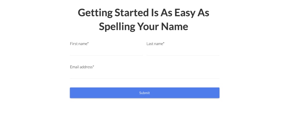
Single Page Forms
As the name suggests, single page forms are those that have all fields on one page. Users can glance at this form type and know exactly what information they are required to fill out.
Single page forms are generally short and quick to complete. This structure of form works especially well for things like lead generation and email sign up forms.
Multi-Page Forms
As the name suggests, the fields of the multi-page forms are spread out. These forms are useful when you need to gather a lot of information, like on a booking form, or a medical questionnaire. The benefit of multi-page forms is that they are much less intimidating and easier to work through.
Choosing appropriate forms for the right task is essential. You can have the most accurate, streamlined website in the world, but if the form is confusing or doesn’t work, nobody will fill it out.
How To Make Your WordPress Forms Beautiful
Forms are among the most user-facing elements of a WordPress website, so making them legible and aesthetically pleasing goes a long way. Beautiful forms are not just about the colors, they should provide a seamless experience for your users too.
Forms are a goal-driven addition to your website which makes it a critical part of your business success.
Once you set your goal, you just have to work your way backwards and understand what makes a form an effective tool. And one way of doing this is to make it inviting using the right design.
Let’s break down the elements of good looking and functional WordPress form:
- Brand theme – Incorporate your branding on the elements of your form. This includes your brand logo, color tones, messaging, typography, and even the shape of the CTA button. Make sure that they are blended together in a way that’s easy to look at. If your brand color is a fiery red, perhaps you can go easy on the tone in your form.
- Navigation – Use progress bars or page numbers to orient your users in how much time it takes or how many questions there are to complete the form. Plus, you also need to show them where they currently are.
- Descriptive CTA – The CTA button is the final step of converting your visitors into leads and you should not go easy on it. Changing the most generic button “Submit” to “Sign Up” can be a game-changer.
- Correct formats – Checkboxes, multiple choice, or drop-down menus will vary depending on your question type. These types of form questions are often used to set up a form with conditional logic which streamlines the respondents’ experience by skipping over the irrelevant sections.
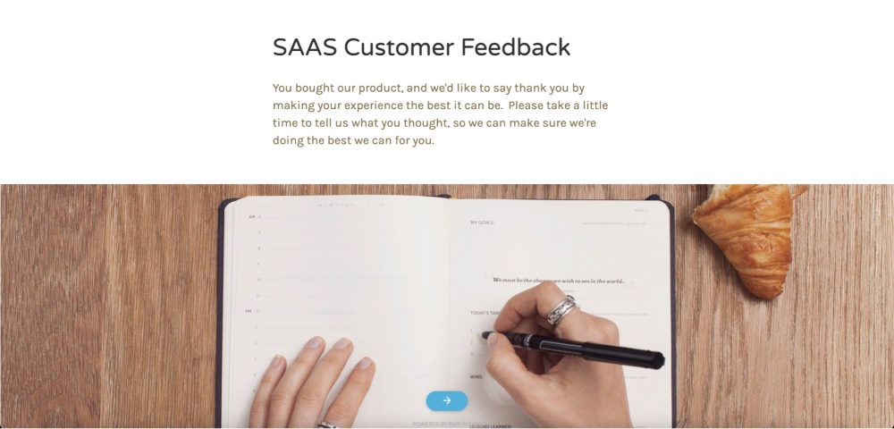
- Compelling visual – People are visual learners, and so if your form can benefit from having an image instead of plain old text, then make sure to use compelling images and videos while also following your brand guidelines.
- Placeholder texts – Placeholders are small yet useful additions to your form. Include samples of what kind of answers you’re expecting from your users.
The Psychology Of Forms

Psychology plays a huge role in how people interact with the internet. Web designers and marketers are in a never-ending struggle to unlock the design principles that would help them to capture the attention of cold audiences, and convert them into customers.
Online forms are not an exception to this. In fact, “form psychology” should be on top of mind as you want to make sure that when a form is presented to your audience, they will fill it out.
Beautiful forms are useless without submissions. So for you to effectively capture information is to understand how your audience thinks and behaves.
Here are some questions to ask yourself before you publish your WordPress form:
Is it easy and quick to complete?
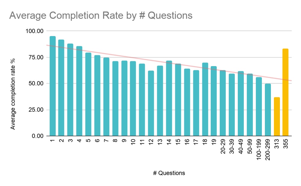
In psychology, a task with a steep learning curve, time-consuming, and complicated is something that most people will give up on. A study by The Baynard Institute found that 26% of users abandoned ecommerce transactions because the process was either too long or too complicated.
That’s why if you can, use shorter forms as they usually get better conversions.
What will my users get out of this?
There is cost vs benefit in forms. Will you drive a stranger for three hours for free? How about if you’re paid $1000 to do it?
The more complicated the task is, the higher the reward is required. So, for instance, you want them to fill out a long survey on what can be improved on your website. Make sure that you offer them something in return, such as a discount or a free item.
Do my users know what this is?
Will there be 50 questions and require 20 minutes to complete? If yes, then let them know and make sure that this is visible right at the beginning. People are less forgiving if they find out that after answering 20 questions, they’re expected to answer 30 more.
Guessing games are a no-no and setting their expectations will produce fewer abandonments.
Is it confusing for my users?
Remember the Paradox of Choice? The idea is that when it comes to choices — “less is more”. And so when people are presented with too many choices, it becomes confusing, and they are more likely to give up the task completely.
Is it nice to look at?
Design elements with the right words are useful in showing the concept that you want to portray. Pair your words with images and use an inviting color tone that can also reinforce your branding.
Can my visitors actually see where my form is?
Nobody will click on something they can’t see. The idea behind the Von Restorff Effect is to make things stand out and memorable. Lead the eyes of your users to where your form is. You can do this by having a strategic placement or creating a contrast between the form and the rest of the page.
Conclusion
Marketers have to go through a series of strategies and spend thousands just to obtain useful data from customers.
Remember to design your WordPress forms to look good without sacrificing function.
When it comes down to deciding which data really matters, make sure you collect at least one piece of contact information. Once you have that, you can always follow up on the rest. Good luck!