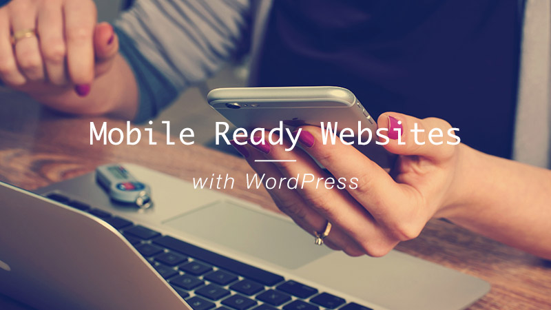
How to Create a Mobile-Ready Site using WordPress
You, my friend, and I are lucky to be living in the time and era of responsive web design. Even without looking hard, you can see the extensive proliferation – in the market – of web applications that adapt to the size of our various devices.
The same web application will look totally different on different screen sizes, which has paved way for new and dynamic ways of reaching out to the customer irrespective of their device.
Today, you can give your users a great experience on your WordPress site, whether they are viewing it on a smartphone, tablet, phablet, desktop or any other device at their disposal.
A while back, online entrepreneurs had to struggle to squeeze mammoth websites into the tiny screens of mobile devices. The problem was nearly solved when someone introduced the idea of creating separate mobile-friendly versions of the desktop sites.
This was okay for a while until problems arose. Firstly, search engines didn’t know what to do with duplicate content, and secondly, webmasters were reluctant to create and manage two separate sites. If that wasn’t enough, the mobile versions weren’t as nearly as effective as their desktop counterparts. It was a conundrum.
But the real solution came in the form and name of responsive web design, or RWD in short. It couldn’t have come at a better time. Online entrepreneurs could finally let out a sigh of relief, for RWD delivered mobile users right into their eager hands.
Even though Cameron Adams demonstrated, in 2004, resolution dependent layout, it wasn’t until May 2010 that Ethan Marcotte coined the term “Responsive Web Design”. Soon afterwards, responsive web design grew in popularity.
History lesson aside, why should you bother creating a mobile-ready site? Unless you live under a rock, it’s pretty obvious. More and more people are using mobile devices to browse your site each day.
Prospects are buying products right from their mobile devices, and if your site doesn’t look good and perform exceptionally well on the smaller screens, you’re leaving a lot of money on the table.
Matt Cutts mentioned something surprising few months ago. He said mobile search might surpass desktop search come 2015, and beyond. Then Google went ahead and appended “mobile friendly” labels to their mobile search results, which means your prospects will know your site isn’t mobile-friendly long before they click through.
This means you can bid goodbye to high mobile conversion rates if yours is fixed-width aka rigid website. Nobody is going to stick around for poor user experience, especially if your competitor has a website that looks great and performs incredibly well on mobile devices.
With that as a primer, how then do you create a mobile-friendly site using WordPress?
Creating a Mobile-Friendly Website using WordPress
WordPress, being the auspicious platform it is, has made web development not only easier, but also pretty straightforward. In a matter of minutes, you can whip up a beautiful 100% responsive website that will excite all your users. Your mobile device users will have as great an experience as your desktop users, which can only mean great things for your WordPress-based business.
Fluff aside, you can create a mobile-friendly WordPress site in two main ways. You can:
- Build/buy a responsive WordPress theme
- Use mobile plugins
We will expound on each, and then list examples of responsive WordPress themes as well as mobile display plugins to get you one step through the door.
Build/Buy A Responsive WordPress Theme
This is the easiest and most elegant way of creating a mobile-friendly website using WordPress. With the WordPress theme market bursting at the seams with great responsive themes, you ought to find one matching your tastes and preferences perfectly well.
Although there are some developers who still release fixed-width (or rigid) WordPress themes, the vast majority of theme released after 2010 are partially or fully responsive. Of course, you want to go with a fully (100%) responsive WordPress theme from the start or when re-designing your site.
Decide early-on the features you’ll need, and then ensure your theme adapts to different viewport widths without breaking said features. There’s a quick way to determine whether or not a WordPress theme is responsive.
Before buying your WordPress theme of choice, the developers usually allow you to test drive it with a demo. Once you load up the demo, resize your browser by clicking on the minimize button and dragging the edges, and then observe the behavior of your theme.
Does it degrade gracefully as you decrease the width of your browser, or does a scroll bar appear at the bottom of the browser? If the theme degrades gracefully, you’ve hit jackpot. Run the other way if a scroll bar appears at the bottom of your browser.
A professionally designed responsive theme should cost less than $100 bucks on trusted websites such as Elegant Themes (they offer yearly subscriptions), and Themeforest among others. You can also develop your own responsive WordPress sites using responsive theme frameworks such as Genesis or Underscores, among others.
Without a doubt, if you have some moolah to splash, hire a WordPress developer to craft you a custom-made responsive theme from scratch. You can even have them hard-code all the features you need to avoid using plugins, some of which might not be responsive.
But if you’re starting out or on a budget, here are a few budget-friendly WordPress themes that are just as responsive as they are beautiful.
Total – Responsive Multipurpose Drag & Drop WordPress Theme

A trending item on Themeforest (with over 9k in sales) at the time of writing, by an elite and reputable author, Total WordPress theme adds ease and fun back to web design. It’s a multipurpose theme, meaning you can build any design imaginable, and 100% responsive to ensure all your glorious designs fit on all device screens.
With awesome support and all the features you’ve always wanted, including Visual Composer to support front-end page building, Total WordPress theme allows you to build a mobile-friendly WordPress site like a boss. Don’t take my word for it, go check out the beautiful demos yourself. And for just $58, the Total WordPress theme is an affodable option for spiffing up your WordPress site.
Divi – Responsive Multipurpose WordPress Theme
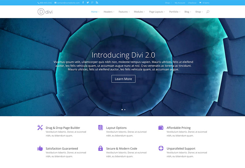
The most popular theme from Elegant Themes, Divi is in a class of its own. Is it fully responsive? You bet it is. How about multipurpose? Come on, please ask another question. PLus it’s part of the Elegant Themes bundle, so if you ever change your mind you have other themes available to you.
And just like with our most favorite theme, Total WordPress theme, you can create unlimited designs using Divi without ever touching a line of code. The theme will set you back $69 bucks, or $89 is you want all of the photoshop files and premium plugins.
Ultra – Flexible & Responsive WordPress Theme
Ultra is the latest theme from Themify, and it’s a great one. It’s powerful and beautifully responsive (oh, and free for a very, very limit time). The most flexible theme from Themify, Ultra has great layout and page building options.
Plus, if you spring for a master club membership, you’ll also get all of Themify’s lovely themes and all of their amazing premium plugins – like the Themify Builder, Announcement Bar, Conditional menus and more!
uDesign – Responsive WordPress Theme

It’s super fast, powerful, beautiful and mobile ready. uDesign is full of the features you need to build WordPress websites out of your dreams, including the gracious Visual Composer, SEO-ready design, WPML support, and WooCommerce.
Basically, you get a one of a kind WordPress theme that lets you build mobile-ready websites without breaking a sweat. Oh did I mention you get awesome support 24/7 and unlimited updates? uDesign has been a Themeforest staple for years at just $58 bucks.
Directory – A Responsive WordPress Theme
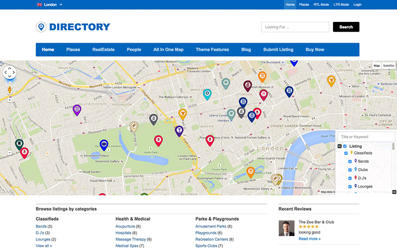
Looking for inspiration for your next WordPress-based business? Well, you just might have found it. You needn’t look further than Directory, a clean, professional and feature-rich handcrafted responsive theme by Templatic.
Directory is a useful WordPress theme suitable for any business that want to share listings, review or any other type of directory (hence the name). And with all of the premium child themes Templatic has created, it’s easy to get started. And just like with all the themes here, support and updates are included, meaning you make the most out of the theme.
The Retailer – Responsive WordPress Theme

Using The Retailer, you can build any mobile-ready WordPress website you can think of. From blogs, personal websites, corporate portals, portfolios and even online stores, The Retailer comes bundled with adequate features to handle anything you throw at it.
It’s 100% responsive, comes with premium addons and reliable customer support as well as video walkthroughs to get you up and running in no time.
That there is a short list of some of the responsive WordPress themes available around the web. By any means, and if you need more options, feel free to visit Themeforest and search “responsive WordPress themes”, and you will get more choices than you’ll ever need.
In addition, you can check out our premium WordPress themes or free WordPress themes for some great responsive WordPress themes. And if your budget is tight, check out the free responsive WordPress themes at WordPress.org.
Moving on…
Creating a Mobile-Ready WordPress Site with Mobile Plugins
If your preferred WordPress theme isn’t responsive, or you don’t want to let go of your current fixed-width theme for your own reasons, you can take advantage of mobile-display WordPress plugins to deliver mobile-friendly experiences to your mobile users.
The process is usually simple; just install your plugin, configure a few options and your work is done. A majority of these plugins have a trigger feature, which instructs the plugin to display a mobile theme to mobile users. The mobile theme is not launched for desktop users.
The following mobile plugins will help you to create a mobile-ready WordPress site easily and quickly:
WPtouch Mobile Free WordPress Plugin
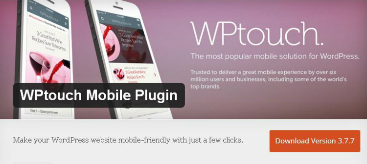
This is probably the most popular mobile plugin for WordPress, what with over 400k active installs. With just a few clicks, you can use WPtouch to enable a “…simple and elegant mobile theme for mobile visitors of your WordPress website.”
WPtouch comes with an intuitive admin panel that enables you to customize how your site will look on mobile devices. The process is pretty straightforward, and never will you touch a single line of code.
Your visitors can also choose between the mobile and desktop versions with a single click. The developers, BraveNewCode, Inc. and Dave Storey among others also provide a pro version that ships with enhanced themes and features. The plugin has an above-average rating of 3.7/5.0.
WP Mobile Detector Free WordPress Plugin
Are you looking to mobilize your WordPress website the easy way? If that’s a resounding yes, WP Mobile Detector is your answer. Thanks to the ingenuity that went into the making of this plugin, WP Mobile Dectector can automatically load a compatible mobile theme if it detects the visitor is on a smart phone or a typical mobile phone.
Special features include detection of 5,000+ mobile devices, image resizing, mobile statistics and automatically formatted content. Further, the plugin is easy to install, customize and use. It comes with seven mobile themes, and you can build your own custom theme using the interactive mobile theme editor. You can even upload your own logo and add mobile ads!
The options are virtually unlimited with WP Mobile Detector. The plugin has a rating of 3.7/5.0, and comes with a pro version that boasts of enhanced capabilities.
WordPress Mobile Pack Free WordPress Plugin
WordPress Mobile Pack goes a step beyond responsiveness by giving you the chance to squeeze your entire WordPress site into a cross-platform mobile application.
The plugin is supported on Windows Phone 8, iPhones, Android Phones, and Firefox OS. Moreover, it’s compatible with all major browsers. From an easy-to-use dashboard, you can customize the appearance of the app, organize posts, pages and comments in categories as well as track mobile usage via Google Analytics.
Other features include support for phablets and tablets, unlimited content sources, unlimited applications, offline mode, monetization and full screen mode among others. As it were, WordPress Mobile Pack is awesomely responsive.
Up to this point, you should be able to create a top-drawer mobile-ready site using WordPress. The best and recommended option, of course, is using a responsive WordPress theme from the word go. If that isn’t a choice for you, you can always count on mobile plugins.
I will go with a responsive WordPress theme any day. What about you? That aside, which tips do you use to make your WordPress site ready for mobile devices? Share with us!