Adding Retina Display Support to WordPress Themes

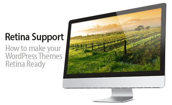
With the ever growing line of retina display products currently only from Apple, its high time you make sure your WordPress theme is looking hot on those devices. In this article I’ll go over the several different options you have to add retina support to your themes.
What is Retina?
Retina Display is a brand name used by Apple for liquid crystal displays which have a high enough pixel density that the human eye is unable to notice pixelation at a typical viewing distance (https://en.wikipedia.org/wiki/Retina_Display).
SO HOW DOES THIS AFFECT THE IMAGES IN YOUR THEMES?
A typical monitor is 72ppi or pixels per inch a Retina display on the other hand ranges from 135-300ppi. What does this mean for the images in your theme, well viewing a 72ppi image on your standard LCD monitor looks all fine and good, but pull that same image up on a Retina display device and it will appear blurred to all hell. How do we remedy this situation? Read on my friend…
1. CSS3 > Images
Probably the most obvious option is to use CSS3, with browser support getting better & better by the day — using CSS3 properties is a no brainer. Things like linear background gradients, border-radius, box-shadow & text-shadow coupled with RGBA when used together for instance can create beautiful buttons like the example below. Without the use of images, the less HTTP requests the faster your site loads.
2. @2x Images
@2x, WTH is that!? Think about 72ppi images, the current standard as @1x which look great on normal displays. Now with Retina displays your looking at basically double the resolution, this is where @2x comes into play, make sense right? Basically @2x is the standard for Retina images and graphics that was put in place by Apple.
When put into use, you would have your 72ppi file something like logo.png and another logo@2x.png, pretty simple.
HOW DO YOU SERVE THAT @2X IMAGE TO RETINA DEVICES?
An awesome open source script Retina.js makes it insanely easy to serve high-resolution images to Retina devices. If a high-resolution variant of that image exists in this case logo@2x.png the script will automatically swap that image in-place. Simple as that.
If you’re using background images in CSS, you’ll need to use a simple media query, something like:
@media only screen and (-webkit-min-device-pixel-ratio: 1.5),
only screen and (-o-min-device-pixel-ratio: 3/2),
only screen and (min--moz-device-pixel-ratio: 1.5),
only screen and (min-device-pixel-ratio: 1.5) {
     #menu-icon { background-image: url(../images/icons/menu@2x.png);}
}
3. Inline img elements
Lets say you have a large photo gallery, and making two version of every image is just out of the question. Another great open source script is Foresight.js, it gives your theme the ability to tell if the users device is capable of viewing high-resolution images before its requested from the server. It also checks to see if the users device currently has a fast enough network connection for high-resolution images. Depending on the device display and network connectivity, foresight.js will request the appropriate image to display.
4. Icon Fonts
Icon fonts are straight up awesome, they’re infinitely scalable, can be changed to any color, have transparent knockouts, change opacity, animate with CSS3, and much more! There’s a quite a few paid and open source solutions out there. Personally I prefer the open source Font Awesome pack, there’s over 220 icons currently, its absolutely free to use for commercial use and its so damn easy to use.
So what are you waiting for? Start applying these practices today!
Retina is still pretty new and I haven’t had a chance to really dive into it much, I think this post is great for beginners that want to learn the basics on how to get started. Thanks for sharing the article Chis!
very interesting to see how things will increase
Thank you for this straight forward approach. I like your way of telling us different solutions without choosing one as the best one.
Glad you enjoyed the article!
Thanks for the good article.
Now I know how retina display work.
But will web developer have to do their website projects with retina support? Seems retina display support will become one of web design trends soon. If so, we will work more than once for just single project. Because you will need to make sure that your project perfectly responsive to any device (desktop, mobile and tablet), and also make sure that your work will have good looking on apple products like iPhone and iPad.
Sorry for my english
Thank you for the kind words. We are glad you have found our website useful! We are working to get more awesome contributors such as Contempo to join our team and write awesome tutorials such as this one. You are correct that a lot of tutorials out there for WordPress are outdated, it’s time to change that!