Tips to Make WordPress Mobile Friendly

It’s quite common to see people using hand held devices to catch up on their reading or to search for anything online. One report estimates that 60% of searches start from a mobile device. If your target audience is a part of this population that’s constantly on the move, you really have no option – you need to make sure that your website looks good and functions great on mobile phones. In this post, let’s look at some things you can do to make your WordPress website mobile friendly.
A mobile-friendly website appears like a tiny version of your regular website. In order to achieve this look, it’s necessary to optimize every element on your website to respond to the size of your screen. And, to attract and retain traffic, you’ll need to ensure that your website is fast loading, especially on mobiles.
A Googlebot looks at many aspects while checking out if a webpage is mobile-friendly, including,
- whether the page includes too many ads, or software that’s not suitable for mobile devices, such as Flash and Java.
- if content sizes down to the screen, and text is readable, without zoom or horizontal scrolling.
- whether links are placed distinctly apart so that they are easy to tap.
Why Should Your WordPress Website Be Mobile-Friendly?
Making a WordPress website mobile-friendly is a natural corollary to the explosive increase in the number of mobiles, better network connectivity and access to wifi at public places. The more compelling reasons are,
- Search engines consider mobile friendliness as a ranking factor. Mobile friendliness is determined on a page by page basis. This means the mobile-friendly areas of your website will rank higher in search results, while remaining content will rank lower.
- A hard-to-browse webpage may result in a higher bounce rate that can hurt your site’s SEO. In contrast, a mobile-friendly webpage can translate into better site speed and SEO.
- Making your webpages mobile-friendly often means that you have clean grids and layouts, and possibly one universal URL and one codebase.
- Mobile friendliness improves brand reinforcement and sales.
How To Make Your WordPress Website Mobile Friendly
Nowadays, modern WordPress themes such as Total are responsive, and can display the website on any device. But, you can do many things to optimize your website for mobile, in addition to using a responsive theme.
1. Us a Mobile First Approach
In the present digital scenario, the importance of being mobile-friendly cannot be over stressed. In the US, digital media time for mobiles is higher at 51% compared to desktops at 42%. To reach this tap-and-swipe audience, website owners are not merely optimizing existing website design for multiple screen sizes. They are going a step ahead and adopting a mobile first approach.
The mobile first approach creates a UX design specifically for mobiles, and prioritizes content strategy for the smaller screen size. It does not merely optimize the existing regular desktop website for mobiles.
Another important reason to go mobile-first is Google’s announcement in November 2016 to shift gradually to a mobile first indexing. This method of indexing involves Google first checking the site’s mobile pages for indexing, ahead of the desktop pages. While selecting a site for the mobile first index, Google uses “classifiers” to find out how ready a site is for the mobile-first index. Classifiers determine how equal or comparable the desktop site is to the mobile site when it comes to content, links, schema, multimedia, etc. In fact, in October Gary Illyes from Google indicated to an audience at the SMX East conference in New York City that some sites are already on the mobile index list, with more to follow.
2. Optimize Images
Images files are typically byte-heavy. They load more slowly than other resources like text and HTML. To make your website mobile-friendly, you need to optimize images to fit smaller screens. Since version 4.4 WordPress largely takes care of this, but you can always also use a WordPress plugin to further optimize your images.
You can do much more to optimize images, always keeping in mind that optimizing images requires a balance between user experience, visual appeal and page performance. First off, remove images that do not add value. Next, even before uploading the images, optimize the images by compressing them to smaller file sizes. If you’re using Photoshop use the Save for Web option. Online tools such as TinyPNG or plugins like WPSmush can also do the job quite efficiently. Also, there’s a Github page that can help you compare different compression tools. To find out more about image optimization, use our image optimization guide.
3. Implement Accelerated Mobile Pages
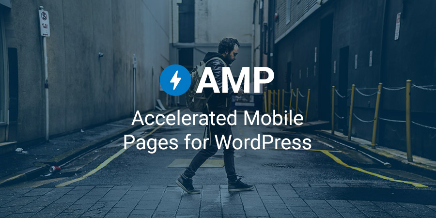
Accelerated Mobile Pages is an open source initiative by Google to provide fast loading content on mobiles. It gives publishers the means to create mobile-friendly content just once, and have it load everywhere on the mobile web instantly. AMP is actually a whole lot of optimizations to the website done in a uniform way as required by Google. A standard range of ad formats, ad networks and technologies will be available. At the same time, publishers can also choose their own formats, so long as it is not a drag on speed. We have our own AMP for WordPress tutorial for creating AMP pages to help get you started. We’d also recommend AMP Start from Google also helps you create great looking AMP pages, with ready-to-use AMP templates and components.
AMP content will be instantly available on a Google search and accessible via social platforms like Twitter, LinkedIn and Pinterest.
The special formatting and delivery of pages for mobiles makes these pages much faster on mobile devices. The average loading time for an AMP page to load from Google is less than half a second. As of October 2017, more than 25 million website domains have published more than 4 billion AMP pages. AMP leads to a 10% increase in website traffic and doubles the time spent on page. AMPed e-commerce websites witnessed a 20% increase in sales conversions over and above non-AMP pages.
AMP is not yet a ranking factor however, it can have a major impact on user experience and consequently on SEO.
4. Avoid Full Screen Popups
There’s no doubting that popups work. However, while using popups, we need to always keep user experience at the forefront. Popups that are relevant to the context, have catchy headlines and offer real value to the reader have a better shot at conversion. On the other hand, spammy, hard to dismiss popups that display ads over the main content are sufficient to send a visitor scurrying away.
When a user clicks through a page from Google, the content that you have indexed in a mobile search must be readily available. Or else, they may not rank highly in mobile search results (since January 2017). Popups in response to legal obligations, such as for cookies and age confirmations, or for login dialogs that allow access to locked-in content are fine with Google. Same is the case with ads that occupy minimal screen space and are easily dismissible.
On the contrary, popups that appear as soon as a visitor reaches the page from a search, that cover the main content, or that appear while a visitor browses, do not find favor with Google. Ditto for standalone interstitials that a user has to dismiss before accessing the main content.
Other good practices to follow with respect to popups on mobiles include avoiding full screen popups, or including expandable content such as accordions or expandable boxes on your mobile site. Use smaller messages like banners, inlines or slide ins, or hide content behind tabs.
John Mueller of Google advises that interstitials that show up between the search click and accessing content has a negative impact on ranking. Consequently, popups while moving from page to page or exit intent popups may not affect ranking.
5. Consider Creating a Mobile App
A mobile app is a computer program that runs on a mobile device such as a phone or watch. For instance, Amazon has a shopping app Alexa. Apps are now available, and downloadable for everything – for utility, productivity, navigation, entertainment, sports or fitness. Facebook is the most downloaded app, with 140 million monthly app downloads.
Many websites have both mobile websites and mobile apps. An app provides specific information in an easy-to-understand format. It’s intuitive to use and offers more interactivity. Today, much of the eCommerce activity, including payments is transacted via mobiles. That being the case, mobile apps are here to stay and grow in numbers. The best part is that it’s easy to turn your WordPress website into an app or to make an app for your small businesses.
Mobile apps increase traffic by allowing users to tap directly from their phones. Users can access you in an instant with a few clicks. Apps help you reach more customers and integrate well with social networks. You can use apps to regularly update your product list and make discounts and offers. Or, tie up with partner websites for access to your app and for better visibility.
To Wrap Up
After you’ve carried out all the optimizations to make your website mobile-friendly don’t forget to test it on PageSpeed Insights. The Google Mobile Friendly Test also tests websites on a per URL basis.
The tips in this post are by no means exhaustive. There are tons of optimization WordPress plugins and more guides to help you improve your website on mobile. So if you have anything to add, or have question for us, please share in the comments below.


Also Facebook Instant Articles very important for mobile visitors, it should definitely be added to your list.