20+ Best Fashion WordPress Themes
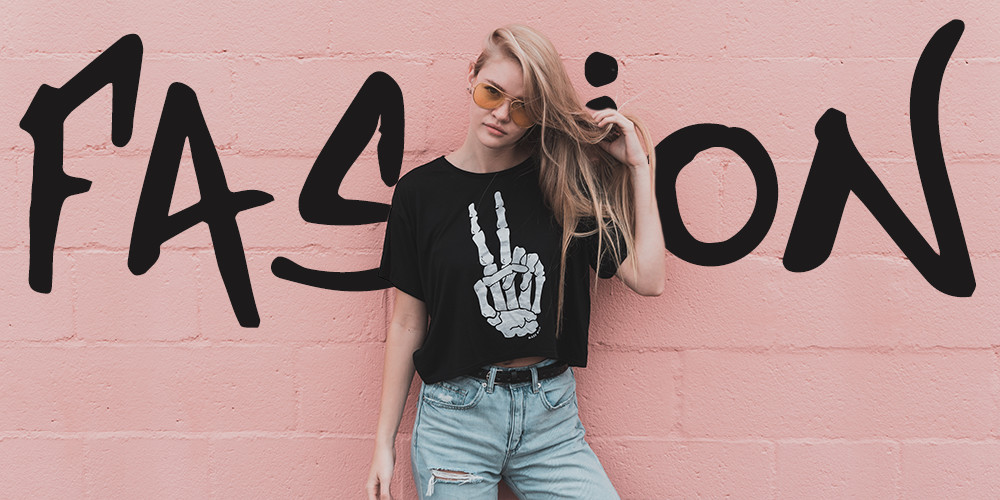
Bill Cunningham, a legendary Times fashion photographer once said: “Fashion is the armor to survive the reality of everyday life.” You cannot help but totally agree with this statement. Fashion betters our life and spices it up with bright colors, trendy clothes, elegance of style and gorgeous simplicity – which is why fashion WordPress themes are the center of our focus today.
As digital technology has penetrated to all spheres of life, it has a huge influence on the fashion world as well. For example, who wants to trudge down the high street when you can go shopping from home? If you need, you can look through the latest collections of any well-known designer on his official website or order any item on any online retail. There are tons of fashion magazines, blogs, e-stores, and video channels on the web.
You can become a part of that stylish online community and present your own business venture based on one of best WordPress themes for blogs dedicated to fashion topics, and we’ve collected the best fashion WordPress themes to help get you started.
What Makes Up an Effective Fashion Website
If you are going to work on your fashion or style website, there are some key points to consider.
- An effective fashion website needs to be user-friendly, simple, and responsive. Most premium themes are developed with a top-rated options, amazing plugins, extensive functionality and a stunning collection of page layouts for all occasions. Moreover, WordPress is one of the most versatile CMS that is easy to setup, manage and update.
- Your fashion website has to display stylish products to the best advantage. That’s why you should pay attention to quality, pixel-perfect photography. Pictures are the main component of impressive, eye-catching website design. For fashion photographer, it would be recommended to upload large, full-screen images to attract the attention of potential clients to the portfolio.
- Typography for a fashion website should be legible yet elegant. Choose the typeface that will answer the overall mood and style of your site. Do not downplay the importance of this web element because it is a driving force of communication art that takes 95% of design. Fonts convey a feeling and allow the reader to focus on the content.
- And last but not least use bold, contrasting colors. When you opt for a complementary color palette the text on the site becomes easily readable and more catchy.
Now that you know what makes up great fashion WordPress themes – let’s get into our top picks. We’ve put together a collection of best selling WordPress themes for fashion solutions that can be turned into any fashion website – blog, model agency, online magazine or e-store – with little to no effort.
1. Total
With Total you can easily build a stunning and fashion forward blog. The theme features tons of features you can use to create a bold and minimal layout. Choose from ready to import sample demos, get started with pre-made section templates or create your own design using the extended WPBakery page builder.
Total also includes full support and styling for WooCommerce, so you can add your own trendy store to your website. And there’s also lots of custom builder elements and customizer settings to make it fit your style!
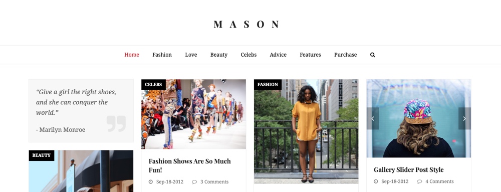
2. Newspaper
Create your own one of a kind and very fashionable website with Newspaper. Don’t let the name fool you – this powerful theme includes a frontend editor, full WooCommerce support, ajax search, touch friendly sliders, newsletters, ad widgets, social counter, lazy loading, customizable footers and much more. There are also more than 1300+ page sections and 120+ ready to import sample sites that you can use to get started fast. Just import a demo, make a few styling or typography tweaks, then get to work adding content. It’s that easy!
3. Responsive
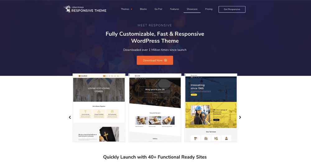
Get this popular, fully customizable, fast , SEO – optimized Responsive WordPress Theme by CyberChimps and create your own fashion website now. You can import stylish and ready-to-use design layouts from 40+ ready site templates that are included, so that all you need to do is add your content. Over 1 million downloads and counting!
4. Julie Bernerro
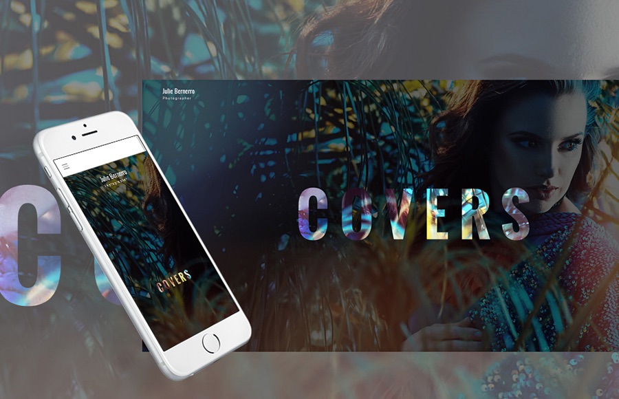
Julie Bernerro is a fully responsive and highly adaptive, gorgeously looking and technologically sophisticated WordPress theme with advanced functionality and impressive design. The theme welcomes you with a screen-size image and distinctive typography. A variety of contrasting colors can help focus the viewer’s attention on specific page elements. Powered by Cherry Framework 5, the template can enhance the performance of your site.
5. Fusion
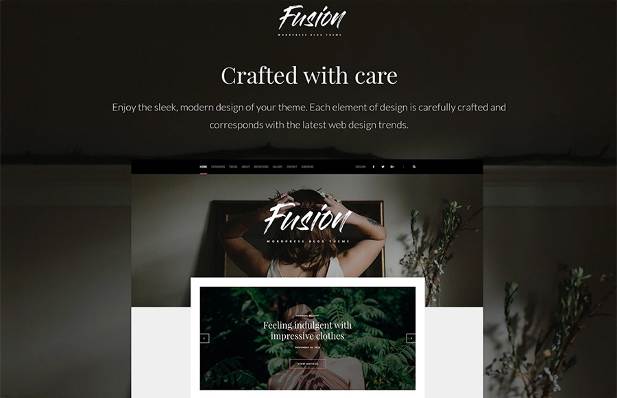
Fusion is a modern, charming, smart and very flexible WordPress theme suitable for building a creative, worth following personal blog. With Live Customizer, you won’t make effort to personalize the theme to your needs because it works smooth and fast without reloading your page. Moreover, there are tons of editable and changeable elements like Google web fonts, page layouts, color scheme, images, etc. Instagram integration, social media buttons, and multiple useful web forms allow to enhance your website performance and functionality to the full.
6. Zorka

Zorka is a theme that looks like it could have been designed by the publisher of Vogue magazine. Although it offers various layouts, it’s specifically designed for a fashion website. For starters, shoppers browsing the catalog can click on a magnifying glass that appears on product images to see a pop-up quick view. This gives people more detail about the product without opening a separate page – an especially user-friendly feature.
The menu is a website designer’s dream. The theme has the XMenu plugin built in, so you can just drag and drop links, text, widgets, and images into the menu to give it more flair.
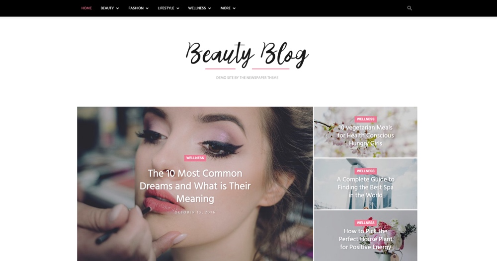
7. Didi
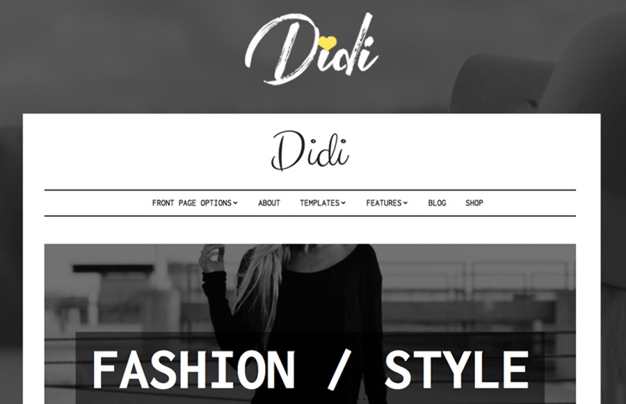
Didi is the theme with attitude thanks to its black and white design and beautiful typography. Whether you blog about fashion, lifestyle, food or anything else for that matter this theme can take your internet presence to another level. The theme’s design features simplicity and minimalism that help to focus visitors’ attention on content.
Didi is built using standard WordPress features like widgets, pages, Customizer and so on. There is no need for heavy page builder plugins to create layouts presented in the demo. As it is a niche theme, it is not bloated with unnecessary features and it comes with features that a blog site needs. There are 6 different blog layout options, 3 header options, color options to change colors of the main theme elements, custom widgets that can be used to build different front page layouts and of course there are a couple of nicely styled page templates for your inner pages.
The theme visually supports WooCommerce plugin and comes with a premium version of Soliloquy slider plugin. Being mobile friendly is a must for SEO these days and Didi is ready for it. It is perfectly responsive and will deliver your content in the best light on any screen size.
8. Olsen
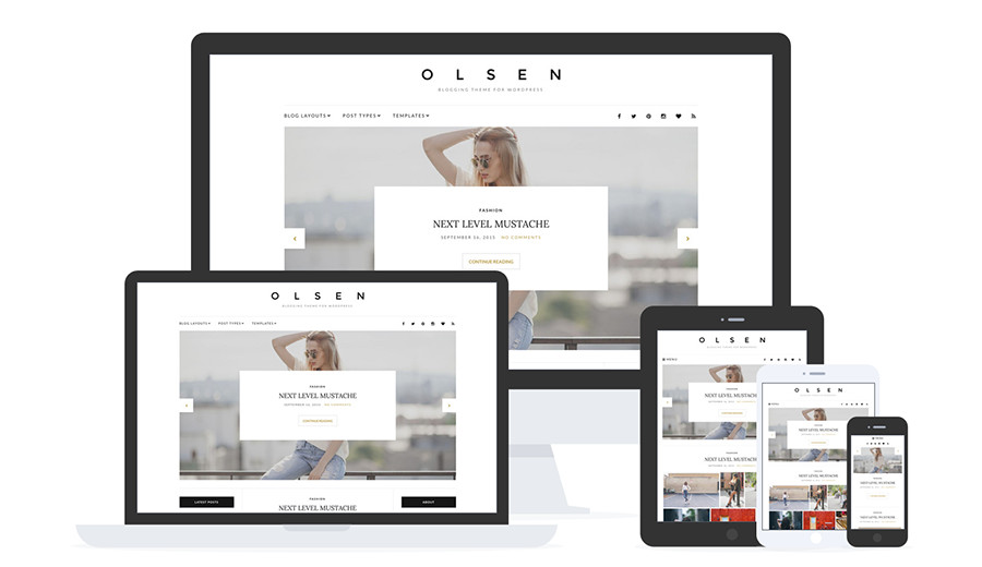
Olsen is a clean and modern personal blogging theme perfectly developed for lifestyle and fashion bloggers. With a clean white design, centered layout, homepage posts slider, customizable widgets (social follow, Instagram, latest posts, newsletter, etc), post formats (image, video, audio, etc) plus more this theme has everything you need to get started with your blog. Plus it’s part of the CSSigniter bundle, so for just $10 more you can get this theme plus 88 other premium themes for one low price!
9. Nelson
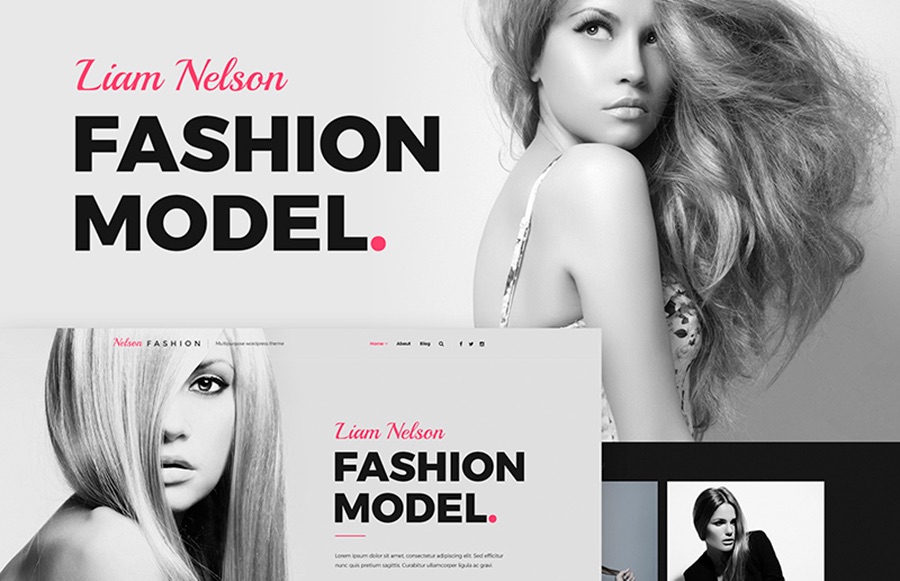
Launch your fashion agency website fast and effortlessly using this super flexible and ultra responsive WordPress theme based on CSS 3 and HTML 5 technology. With clean, valid and optimized source code, the process of optimization will go over instantly. The template offers to set up testimonials, to share your ideas with a handy personal blog page, and to interact with customers through social media integration. Nelson Fashion is equipped with 5 beautiful headers and 3 remarkable footers, 4 blog layouts and other changeable elements that can be easily adjusted to your needs from working Admin panel.
10. Fashion
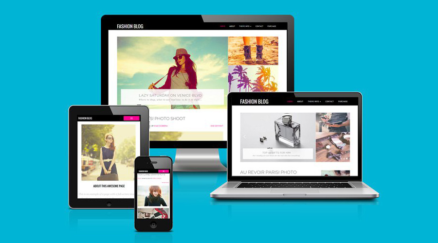
The Fashion Blog theme is exactly what it sounds like – a clean and simple blogging style WordPress theme designed specifically for fashion bloggers. The theme features video and image banner options on all pages to really wow your audience and each post has the ability to include large featured images or image galleries to showcase your latest fashion creations.
The homepage has a two-column layout and the sidebar has plenty of spaces for various widgets such as your biography, social media links, recent post links, and more. The footer is also widgetized and you can use it for contact information or to include your Twitter or Instagram feed.
The theme comes with a fully loaded options panel which allows you to customize every aspect of your theme and PSD files are also included so you can truly customize your website. Ongoing updates and best coding practices will ensure your theme stays up to date and safe from all vulnerabilities.
Full SEO optimization ensures your website is easily indexed by search engines and the social media integration makes it easy to share your content across social media as well as encourage your visitors to follow you. Along with responsive design, photo-friendly layout, and plenty of shortcodes, the Fashion Blog theme has all the tools you need for a stylish online presence.
11. Glossy
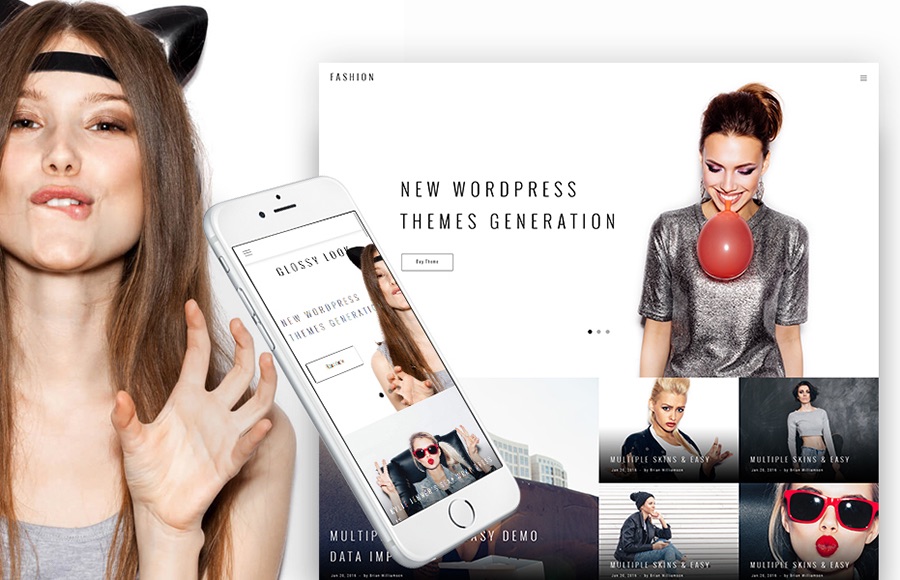
Glossy Look is a carefully crafted, thoughtfully organized and gorgeously looking website template designed especially for your ambitious needs. Whatever business you’re about to launch – a travel magazine or fashion blog, this minimalist and trendy theme will be the right choice for you. Equipped with numerous custom widgets, it enables you to create stunning layouts for all occasions. Thanks to Live Customizer, the process of customization will go over effortless and engaging.
12. Fashion & Style

If you’re looking for a WooCommerce theme that focuses on fashion, how can you go wrong with a theme called Fashion? With just under a thousand downloads as of this writing and a 4.5-star rating, many people have decided that it’s the right choice for their e-commerce needs.
The feature that digital marketers might appreciate the most is the fixed footer. In the demo, that’s used to encourage visitors to subscribe to the company’s email list (you can see it in the picture above). It’s a great tool for webmasters who are looking to build email lists that can be used for promotional purposes.
Fashion also comes with its own mega-menu that can be configured in an either horizontal or vertical layout. If you have a large number of categories that you want to add to a menu that’s configurable based on your layout, you’ll find that this is a welcome addition. Fashion also gives you a live theme editor. That lets you see how your color changes will affect your theme on-the-fly as you’re making changes.
13. Trendomania
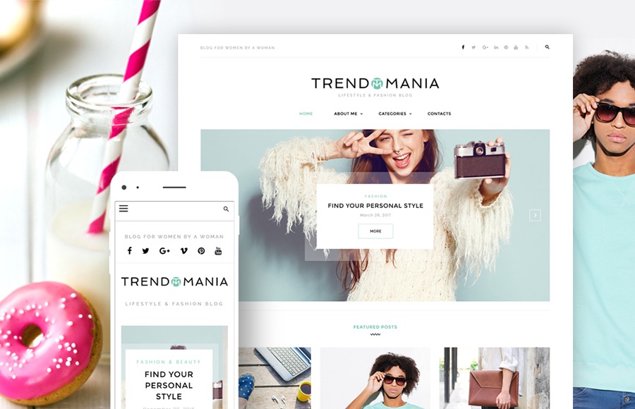
Trendomania is a stylish, impressive and feature-rich WordPress theme that will be definitely appreciated by fashion-savvy fans. Based on this theme, your site will have a bright background with focus on the main content with a distinctive typography. Each element of the template is carefully crafted to satisfy even the most sophisticated user. For your site visitors’ convenience, there are all the necessary elements and options, like Recent comments, Custom posts, blog search and social media buttons on the homepage.
14. Kustrix
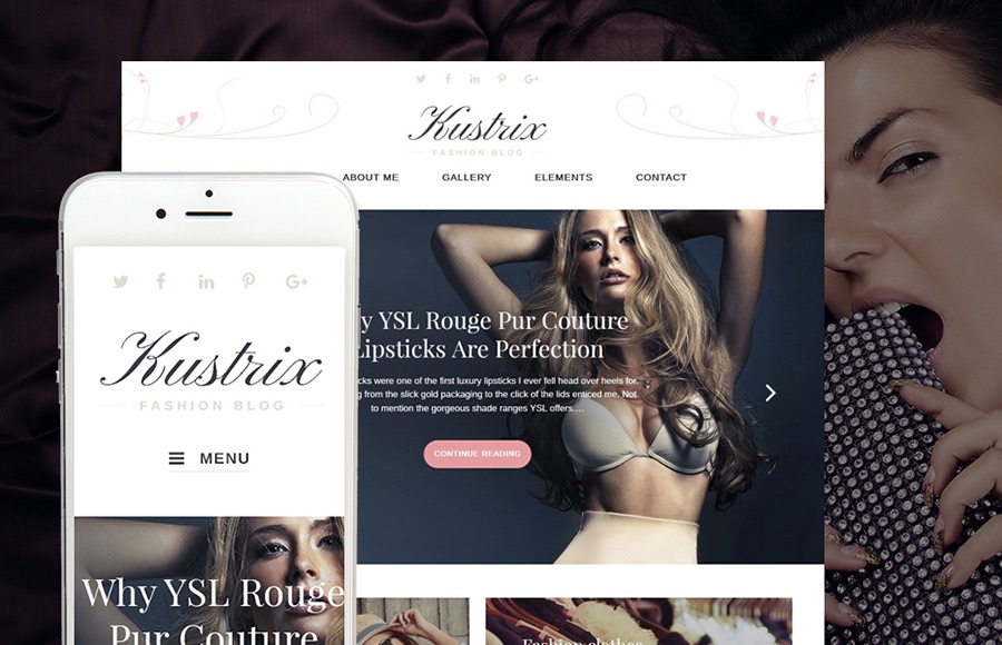
Kustrix promises to become an outstanding, well-organized and catchy fashion blog after easy and fast personalization and customization. This blog is aimed to attract readers, engage them and interact with them thanks to extensive functionality and truly remarkable look. With easy and intuitive page builder, the process of website development will be extremely enjoyable. Kustrix is a 100% GPLv.3 licensed and responsive fashion WordPress theme.
15. Marilyn
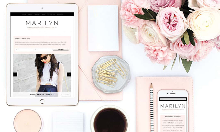
Functional and stylish, the Marilyn WordPress theme includes the features every budding fashion blogger needs. Clean and responsive design, built-in newsletter, easily customized colors, featured homepage slider, promo or call to action buttons, built-in advertising spots (for sponsors), and of course social media buttons are all included. The Marilyn theme is also SEO friendly and translation ready.
16. Jericho
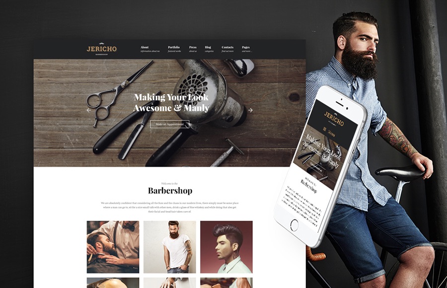
Try out this unique WordPress theme with catchy TM Gallery to display your works in a wide variety of layouts. Jericho offers the powerful and intuitive navigation that will help your visitors find the necessary information about your services. Moreover, powered by Cherry Framework 5, the theme can enhance the performance and functionality of your site. With this fully responsive template, you can display your sticky content on all modern devices and screen resolutions.
17. Ida
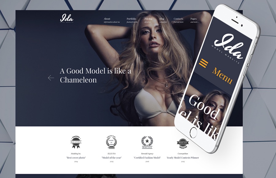
If you are engaged in the fashion modeling business, you need a professional and eye-catching portfolio on the web. Ida is the best choice for those who are looking for efficient ways to display their stunning pictures and achievements. Your photos will look impressive and extraordinary organized with TM Gallery. In addition, multiple content modules like tables, social buttons, sliders, and many more will help to enrich your website appearance and performance to the full.
18. Gisele
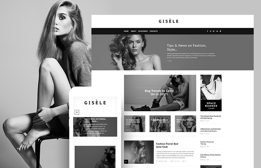
Gisele is a stylish, sleek and modern-looking theme fitting for your fashion and lifestyle blog. Using Live Customizer, you will adjust all the needed elements to your needs in an instant. With drag-n-drop Power page builder, it is possible to expand the functionality of the site up to your preferences. Gisele supports Ecwid option that provides your site with all the necessary features and tools for building e-store in several clicks. The responsive and Retina ready design allows your blog to flow freely on all modern devices.
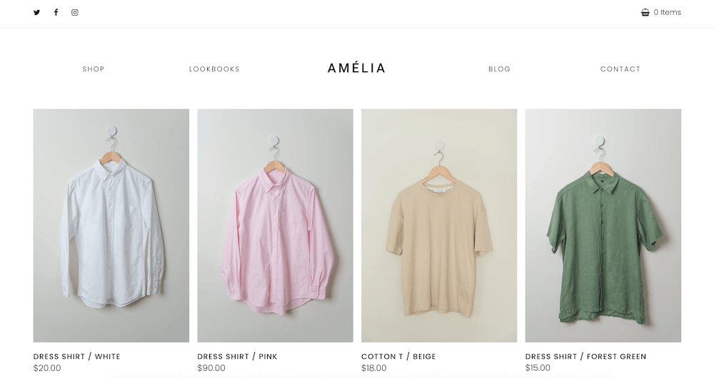
19. InFashion
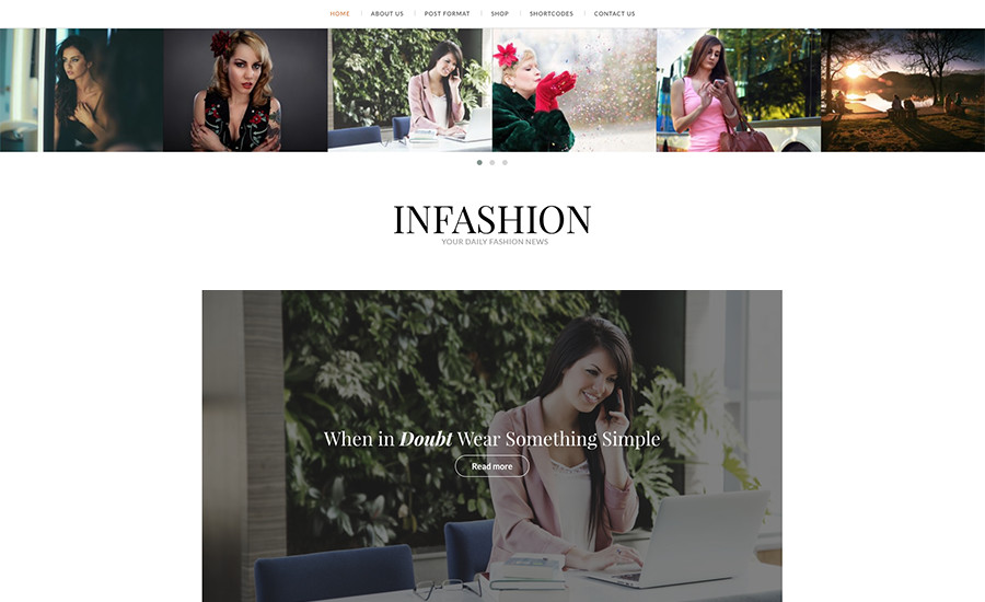
InFashion is a premium fashion blog WordPress theme created specifically with designers and bloggers in mind. Share your experience at fashion shows, create look books, roundup your top picks from seasonal sales and more with the included blog post formats. Plus InFashion includes other desirable theme features like font options, custom widgets, built-in contact form, easy to use shortcodes and even WooCommerce support.
20. Fashionly
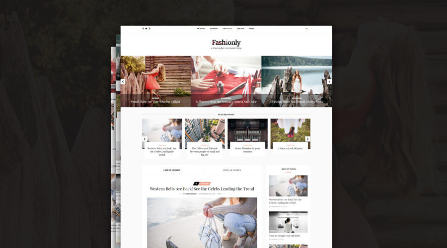
If you’ve been in search of a fashionable yet elegant theme for your blog then Fashionly might be a perfect fit. This theme include 11 prebuilt homepage layouts and 9 lovely styled post formats. With its sleek and minimal design, it gives your fashion blog a fresh new look. Theme is coded with SEO friendly code and it loads faster than many of the similar heavily coded themes on the Themeforest marketplace. With both these SEO friendly and fast loading features, you can improve the rankings of your blog.
The theme is also really easy to use. Once you install and activate the theme, it gives the same look as the demo of the theme. You don’t need to change any settings or install any plugins. Other notable theme features include three header styled to choose from, two different featured sliders, the support for over 500+ custom Google fonts and more. The theme is also translation and RTL ready, so you can easily use this theme in your native language!
Plus there are powerful theme options via the Redux framework (colors, fonts, and more), a unique author page (so your authors can each share their bio and link to socials) and child theme support if you really want to create something one of a kind.
Wrapping Up
The fashion world is highly competitive and demanding. If you strive for success, you have to do whatever you can to survive. Creating a strong comprehensive online presence is a must-have. If you want to save time, energy and money, go for fashion WordPress themes for building a professional fashion website. They are SEO-friendly, user-oriented and modern-looking and absolutely correspond to the newest web trends. With these templates you will believe in yourself and launch a successful website in an instant!
What do you look for in a fashion blogging theme? Or do you have any other recommendations? Leave us a comment below with your thoughts.


The New York theme is amazing. I tried lots of themes here and there but most of the themes were boring and blotted. This New york lifestyle theme is perfect for our shopping blog. It is minimal and clean. Thanks for the share.
Excellent article with helpful hints to start a fashion blog. I appreciate your writing. It will be very helpful.
Yes thank you – I needed to find a fashion theme and this list is full of them
Thanks for sharing such an amazing blog. The safety measure ideas are really helpful. keep sharing such blog.
Excellent blog with helpful idea to start a fashion website. I like your blogs. It will be very helpful.
Thanks for the share.